DREAMWEAVER CS3
User Guide
463
Style Tabbed Panels widget text
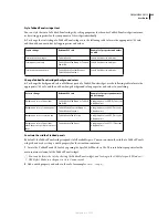
You can style the text of a Tabbed Panels widget by setting properties for the entire Tabbed Panels widget container,
or by setting properties for the components of the widget individually.
❖
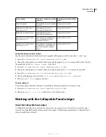
To change the text styling of a Tabbed Panels widget, use the following table to locate the appropriate CSS rule,
and then add your own text styling properties and values:
Change Tabbed Panels widget background colors
❖
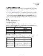
To change the background colors of different parts of a Tabbed Panels widget, use the following table to locate the
appropriate CSS rule, and then add or change background color properties and values to your liking:
Constrain the width of tabbed panels
By default, the Tabbed Panels widget expands to fill available space. You can constrain the width of a Tabbed Panels
widget, however, by setting a width property for the accordion container.
1
Locate the .TabbedPanels CSS rule by opening the SpryTabbedPanels.css file. This rule defines properties for the
main container element of the Tabbed Panels widget.
You can also locate the rule by selecting the Tabbed Panels widget, and looking in the CSS Styles panel (Window >
CSS Styles). Make sure the panel is set to Current mode.
2
Add a width property and value to the rule, for example
width: 300px;
.
Text to change
Relevant CSS rule
Example of properties and values
to add
Text in the entire widget
.TabbedPanels
font: Arial; font-size:medium;
Text in panel tabs only
.TabbedPanelsTabGroup or .Tabbed-
PanelsTab
font: Arial; font-size:medium;
Text in content panels only
.TabbedPanelsContentGroup or
.TabbedPanelsContent
font: Arial; font-size:medium;
Color to change
Relevant CSS rule
Example of property and value to
add or change
Background color of panel tabs
.TabbedPanelsTabGroup or .Tabbed-
PanelsTab
background-color: #DDD; (This is the
default value.)
Background color of content panels
.Tabbed PanelsContentGroup or
.TabbedPanelsContent
background-color: #EEE; (This is the
default value.)
Background color of selected tab
.TabbedPanelsTabSelected
background-color: #EEE; (This is the
default value.)
Background color of panel tabs
when the mouse pointer moves over
them
.TabbedPanelsTabHover
background-color: #CCC; (This is the
default value.)
September 4, 2007

