DREAMWEAVER CS3
User Guide
451
See also
“Define a Spry XML data set” on page 480
“Spry effects overview” on page 486
Working with the Accordion widget
About the Accordion widget
An Accordion widget is a set of collapsible panels that can store a large amount of content in a compact space. Site
visitors hide or reveal the content stored in the accordion by clicking the tab of the panel. The panels of the accordion
expand or contract accordingly as the visitor clicks different tabs. In an accordion, only one content panel is open
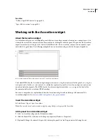
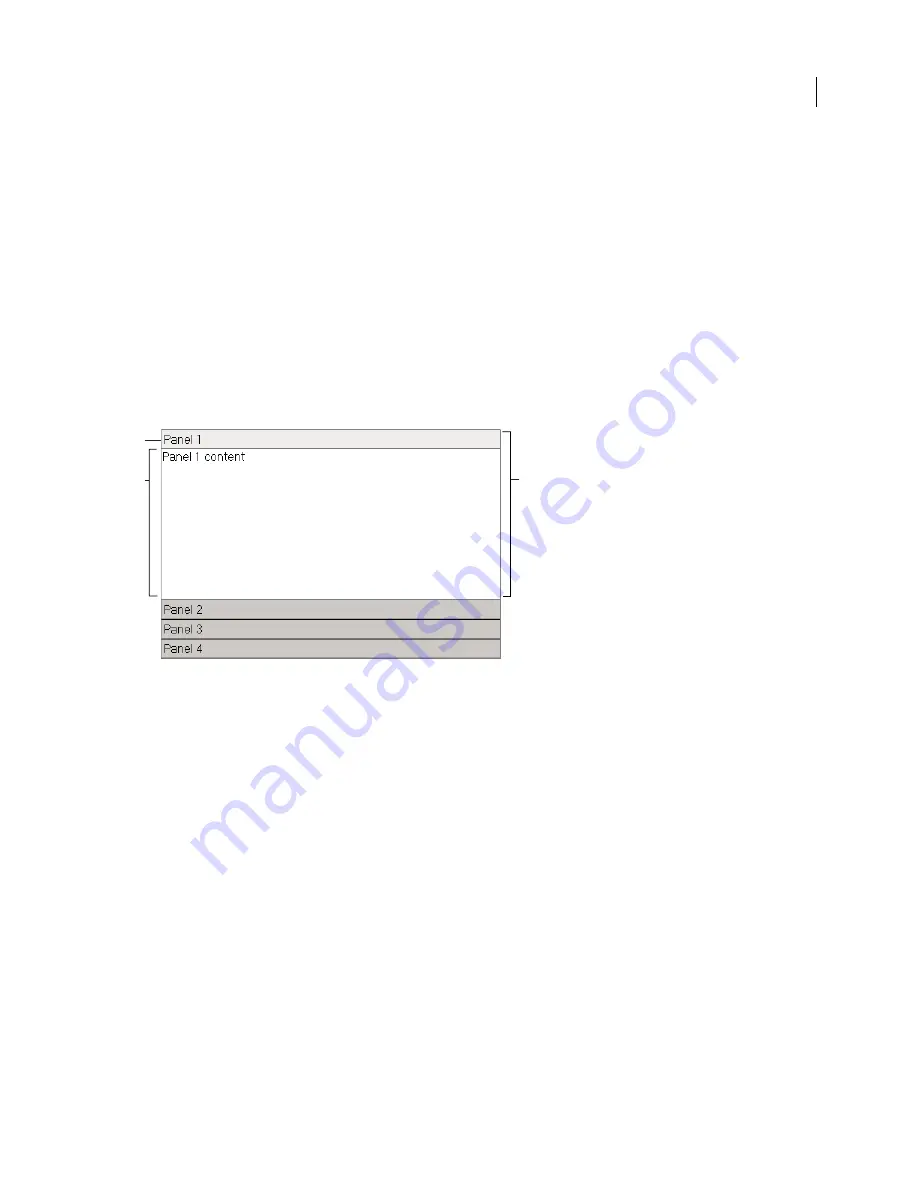
and visible at a given time. The following example shows an Accordion widget, with the first panel expanded:
A.
Accordion panel tab
B.
Accordion panel content
C.
Accordion panel (open)
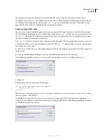
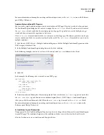
The default HTML for the Accordion widget comprises an outer
div
tag that contains all of the panels, a
div
tag for
each panel, and a header
div
and content
div
within the tag for each panel. An Accordion widget can contain any
number of individual panels. The HTML for the Accordion widget also includes
script
tags in the head of the
document and after the accordion’s HTML markup.
For a more comprehensive explanation of how the Accordion widget works, including a full anatomy of the
Accordion widget’s code, see
www.adobe.com/go/learn_dw_spryaccordion
.
Insert the Accordion widget
❖
Select Insert > Spry > Spry Accordion.
Note:
You can also insert an Accordion widget by using the Spry category in the Insert bar.
Add a panel to an Accordion widget
1
Select an Accordion widget in the Document window.
2
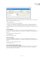
Click the Panels Plus (+) button in the Property inspector (Window > Properties).
3
(Optional) Change the name of the panel by selecting the panel’s text in Design view and altering the text.
A
B
C
September 4, 2007

