DREAMWEAVER CS3
User Guide
475
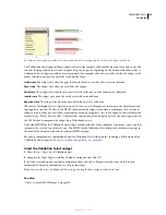
Although you can easily edit rules for the Validation Select widget directly in the accompanying CSS file, you can
also use the CSS Styles panel to edit the widget’s CSS. The CSS Styles panel is helpful for locating the CSS classes
assigned to different parts of the widget, especially if you use the panel’s Current mode.
See also
“The CSS Styles panel in Current mode” on page 125
Style Validation Select widget error message text
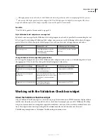
By default, error messages for the Validation Select widget appear in red with a 1-pixel border surrounding the text.
❖
To change the text styling of Validation Select widget error messages, use the following table to locate the appro-
priate CSS rule, and then change the default properties, or add your own text styling properties and values:
Change Validation Select widget background colors
❖
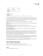
To change the background colors of the Validation Select widget in various states, use the following table to locate
the appropriate CSS rule, and then change the default background color values:
Working with the Validation Checkbox widget
About the Validation Checkbox widget
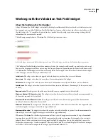
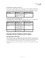
A Spry Validation Checkbox widget is a check box or group of check boxes in an HTML form that display valid or
invalid states when the user selects or fails to select a check box. For example, you can add a Validation Checkbox
widget to a form in which a user might be required to make three selections. If the user fails to make all three selec-
tions, the widget returns a message stating that the minimum number of selections has not been met.
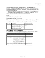
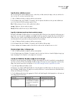
The following example shows a Validation Checkbox widget in various states:
Text to style
Relevant CSS rule
Relevant properties to change
Error message text
.selectRequiredState .selectRe-
quiredMsg, .selectInvalidState
.selectInvalidMsg
color: #CC3333; border: 1px solid
#CC3333;
Background color to change
Relevant CSS rule
Relevant property to change
Background color of widget in valid
state
.selectValidState select,
select.selectValidState
background-color: #B8F5B1;
Background color of widget in
invalid state
select.selectRequiredState, .selec-
tRequiredState select, select.select-
InvalidState, .selectInvalidState
select
background-color: #FF9F9F;
Background color of widget in focus
.selectFocusState select,
select.selectFocusState
background-color: #FFFFCC;
September 4, 2007

