DREAMWEAVER CS3
User Guide
694
You can select an existing DataSet or enter an arbitrary value. By default, the first DataSet in the list is selected.
4
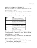
Specify the data to be displayed in the DataList by doing the following in order:
a
Select the Item template for the Templates list. The Item template represents all the rows in the list other than the
header and footer rows.
b
Click the Add Data Field To Contents button.
c
In the Add Data Field dialog box, select a DataSet column and click OK. Dreamweaver adds an appropriate data
binding expression to the Contents box in the DataList Object dialog box.
d
Format the data to be displayed by enclosing the binding expression with HTML tags in the Contents box.
5
Adjust the layout of the DataList, as required.
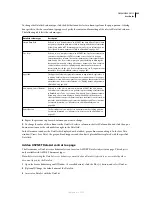
You control the layout of a DataList by selecting from the templates in the Templates list, and then adding HTML
tags in the Contents box. The following table lists the available templates:
6
To organize the items in a table, select the Organize Items In A Table option.
If using a table, specify the number of columns in the table. If the number is greater than 1, specify a fill order for the
table cells: select the Wrap Top To Bottom option to wrap the data horizontally or the Wrap Left To Right to wrap
the data vertically.
7
Click OK to close the dialog box and create the DataList.
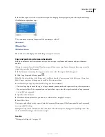
In the Document window, the DataList object is displayed with a tabbed, gray outline surrounding it. In the Live
Data window (View > Live Data), the gray outline disappears and the object’s placeholder is replaced with the
specified DataList.
Modify an ASP.NET DataGrid or DataList control
You can always modify the DataGrid and DataList controls to suit your page design needs.
•
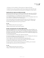
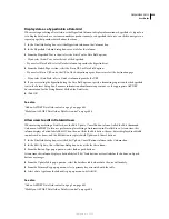
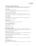
In Design view, click the icon on the upper-left corner of the DataGrid or DataList to switch to Edit mode; then
add or modify the content of any of the tabbed regions that appear.
Note:
You can also drag sources of dynamic content from the Bindings panel into a tabbed region.
Template
Description
Header
The text and controls to render at the beginning of the list.
Item
The HTML elements and controls to render once for each row in the
data source.
Alternating Item
Similar to the Item template element, but rendered for every other row in
the DataList. If you use this template, you typically create a different look
for it, such as a different background color than that of the Item template.
Edit Item
The layout of an item when it is in edit mode. This template typically
contains editing controls such as Text Box controls.
Select Item
The elements to render when the user selects an item in the DataList.
Typical uses are to visually mark the row using a background or font color.
You can also expand the item by displaying additional fields from the
data source.
Separator
The elements to render between each item. A typical example might be a
line (using an <HR> element).
Footer
The text and controls to render at the end of the list.
September 4, 2007

