148
•
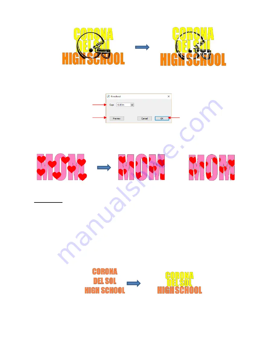
To open the
Knockout
function window, select two or more shapes and go to
Effects>Knockout
:
•
The
Gap
will create an offset between the top image and the bottom image. This is not only pleasing to the
eye but also makes alignment of two layers of HTV easier to manage. Here’s an example showing how the
gap affects the overall appearance:
•
IMPORTANT!
When you click on
Preview,
it will take a few seconds or longer for the image to update. Be
patient. Also, in cases where you have multiple images on top, such as the hearts in the prior screenshot, it
is recommended that those shapes be joined first using
Object>Merge
.
•
When prepar
ing text, you want as little “white space” as possible. Thus, here are some guidelines:
Select a thick dark font. In the examples in this section,
Impact
was used.
After creating the text, move rows of letters together until they almost touch.
Reduce spacing between words, but make sure the text is still readable.
The text does not need to be all one shape. Thus, you can recolor parts of it if you wish.
•
When aligning the top image over the lettering, note that anything extending outside of the image or over
white areas will be deleted. So, size the image accordingly:
Click here to preview the
results of the
Knockout
Enter a
Gap
size, if desired
Click on
OK
when done
Knockout
with 0
Gap
Knockout
with 0.05”
Gap
Summary of Contents for KNK Force
Page 306: ...306...


