


Line and character spacing
Set leading
Kern and track
Shift the baseline
Turn fractional character widths off or on
Set leading
The vertical space between lines of type is called leading (rhymes with sledding). For Roman type, leading is measured from the baseline of one
line of text to the baseline of the line above it. The baseline is the invisible line on which most letters sit. You can apply more than one leading
amount within the same paragraph; however, the largest leading value in a line of type determines the leading value for that line.
Note: When working with horizontal Asian type, you can specify how leading is measured, either from baseline to baseline or from the top of one
line to the top of the next.
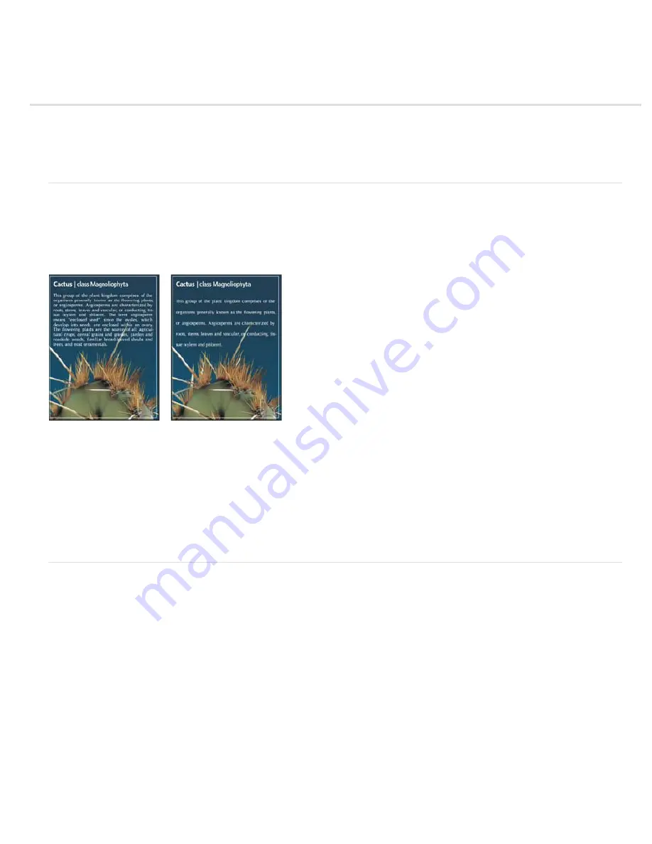
Five-point type with 6
-
point leading (left) and with 12
-
point leading (right)
Set the leading
1. Select the characters you want to change. If you don’t select any text, the leading applies to new text you create.
2. In the Character panel, set the Leading value.
Change the default auto leading percentage
1. Choose Justification from the Paragraph panel menu.
2. For Auto Leading, enter a new default percentage.
Kern and track
Kerning is the process of adding or subtracting space between specific pairs of characters. Tracking is the process of loosening or tightening the
spacing between the characters in selected text or an entire block of text.
You can automatically kern type using metrics kerning or optical kerning. Metrics kerning (also called Auto kerning) uses kern pairs, which are
included with most fonts. Kern pairs contain information about the spacing of specific pairs of letters. Some of these are: LA, P., To, Tr, Ta, Tu,
Te, Ty, Wa, WA, We, Wo, Ya, and Yo. Metrics kerning is set as the default so that specific pairs are automatically kerned when you import or type
text.
Some fonts include robust kern
-
pair specifications. However, when a font includes only minimal built
-
in kerning or none at all, or if you use two
different typefaces or sizes in one or more words on a line, you may want to use the optical kerning option. Optical kerning adjusts the spacing
between adjacent characters based on their shapes.
Summary of Contents for Photoshop CS6
Page 1: ...ADOBE PHOTOSHOP Help and tutorials...
Page 65: ...Legal Notices Online Privacy Policy...
Page 100: ...Image and color basics...
Page 108: ...Legal Notices Online Privacy Policy...
Page 176: ...Legal Notices Online Privacy Policy...
Page 182: ...Legal Notices Online Privacy Policy...
Page 193: ...applied to the original Smart Object More Help topics Legal Notices Online Privacy Policy...
Page 236: ...Legal Notices Online Privacy Policy...
Page 286: ...More Help topics Adjusting image color and tone in CS6 Legal Notices Online Privacy Policy...
Page 376: ...Legal Notices Online Privacy Policy...
Page 457: ...Text...
Page 461: ...Legal Notices Online Privacy Policy...
Page 548: ...Legal Notices Online Privacy Policy...
Page 570: ...Saving and exporting...
Page 598: ...Printing...
Page 627: ...Legal Notices Online Privacy Policy...
Page 646: ...Web graphics...
Page 662: ...Legal Notices Online Privacy Policy...
Page 722: ...Legal Notices Online Privacy Policy...
Page 730: ...Color Management...
Page 739: ......
Page 748: ......


