L-VIS User Manual
98
LOYTEC
Version 6.2
LOYTEC electronics GmbH
Each item object can hold zero or more page objects and zero or one menu object, as shown
in the object hierarchy diagram. It depends on the connected objects, what will happen
when the user selects the menu item.
Pages
Menu
Function
None
None
This item is a
return item
. When the user selects it, the current
menu will close and the parent menu will open.
1
None
A
standard item
. Upon selection, the menu will close and the page
will be shown.
> 1
None
A
multi-page item
. Upon selection, the menu will close and the
page which was up when the item was active the last time will be
shown (the first page, if this is the first time the item is selected).
The page flip action touch gesture, and page timeout applies.
None
Yes
A
sub-menu item
. Upon selection, the connected sub-menu will be
shown for further navigation.
1 or more
Yes
A
combined item
. The connected page(s) will be shown in the
background, while the connected menu will open in the foreground
for further navigation. This type of item can be confusing for the
user and should be used with care.
Table 12: Function modes of a menu item
Always add a return item as the last item of your sub-menu, or the user will not be
able to navigate back to the parent menu.
In the root menu, a return item is used in a different way. If a return item is found in the
root menu, the device will use it to connect the system setup sub-menu to it, making it the
setup menu item. This is done so that the user may provide a menu item for the built-in
setup menu and configure the item through the normal configuration software, just like any
other menu item.
NOTE:
If the project does not provide a return item as the last item of the root menu and the built-
in setup menu was not disabled in the project settings, a default setup menu item will be
created automatically. However, this item will most likely not fit the design of the other
items in your root menu, so it is a good idea to always provide this item in your project.
9.3.1 Menu Item Properties
On the
Common Properties
page, a menu item can be assigned a text as well as an icon
bitmap. Obviously, at least one of them should be set to make a usable menu item. If both
icon and text are set, the icon will appear on the left side, the text on the right side. If the
icon is smaller than the reserved bitmap width of the menu, the icon will be centered inside
the bitmap width.
On the
Color
property page, the following colors can be set for the menu item:
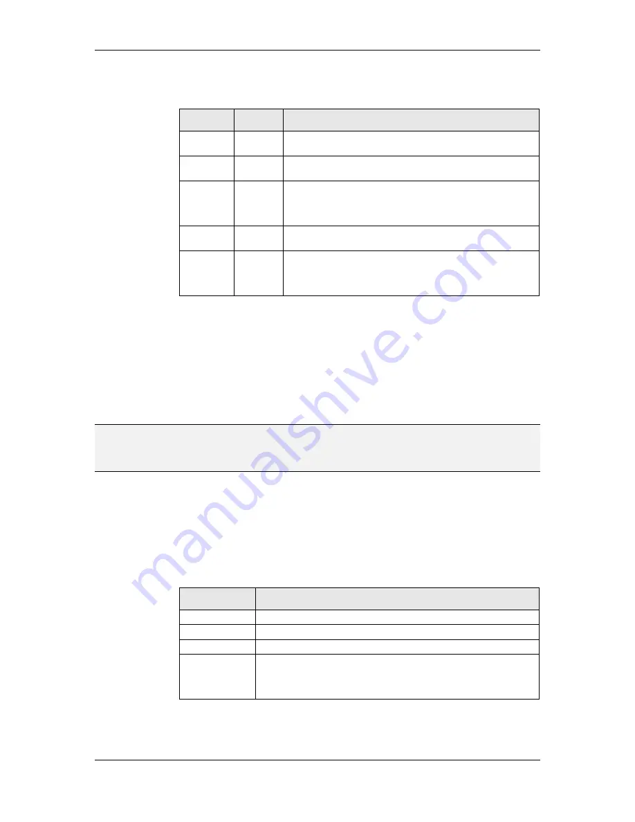
Color Name
Element to which the color applies
Text
Menu item text.
Selection Frame
Frame drawn around the selected item.
Icon Bitmap
Color of a monochrome bitmap.
Icon
Background
Color of the bitmaps background. This will be the color which is shown
transparent in the items bitmap, if the bitmap has no alpha channel or the
project is not true color. The background of a menu item is always set to
transparent mode.
Table 13: Color assignment for menu items


