L-VIS User Manual
126
LOYTEC
Version 6.2
LOYTEC electronics GmbH
from (weekly/low/normal/high). The mapping is optimized to work together with
schedules generated by LWEB-900, which also uses distinct priority levels for
the entered events. Even in a standalone system, it may make sense to use this
option to make the UI easier to read for users which are not familiar with the
numerical priority scheme of the underlying network technology. When this
option is turned off, the technology specific priority numbers will be used
directly, so the user needs to know how they work. Usually, lower numbers mean
higher priority, and the allowable range is different for each network technology
(0 to 15 for BACnet, 1 to 127 for CEA709, 255 as a special priority to indicate
use of the weekly schedule).
Prefer event list over time table:
This option changes the navigation on the
weekly overview page. Normally, touching a day column switches to the time
table of the selected day, whereas touching the day column header shows the
event list. Turning this option on, means that the user prefers to go directly to the
event list. Therefore, touching the day column will show the event list, whereas
touching the day column header will show the time table.
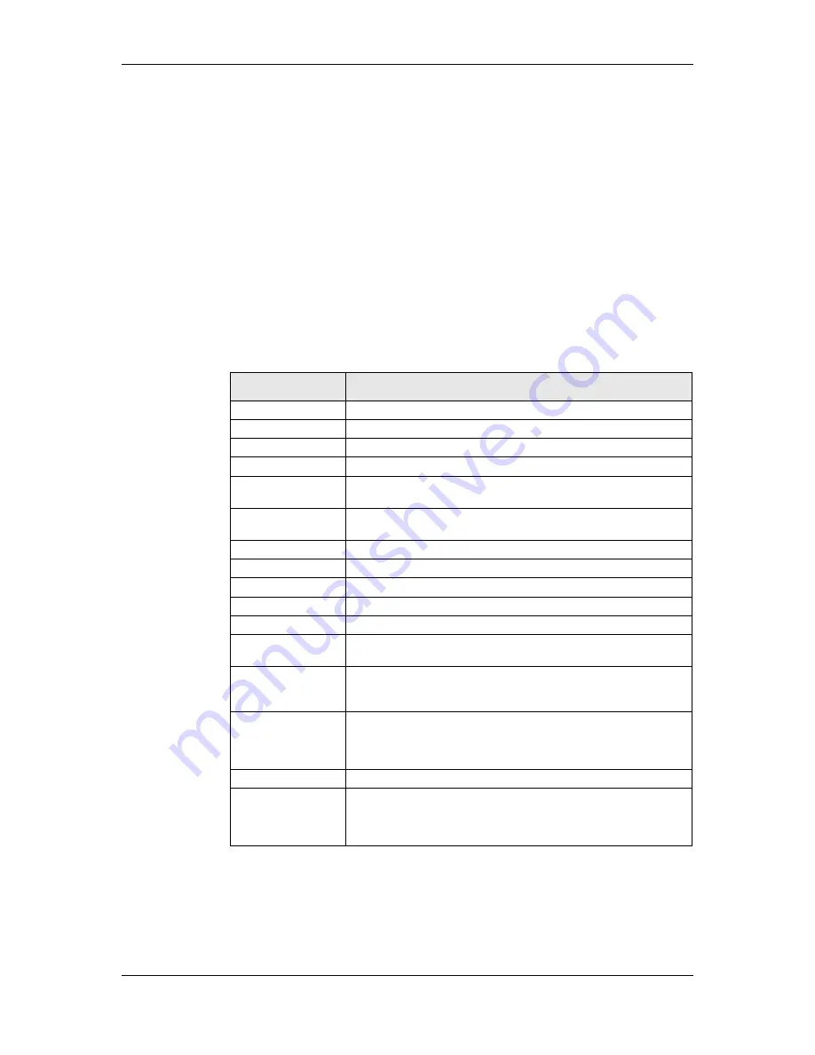
The following colors may be set for schedule controls on the
Color
property page:
Color Name
Element to which the color applies
Text
Color for all text areas of the control.
Highlight
Highlight color of 3D frames.
Shadow
Shadow color of 3D frames.
Horizontal Grid
Grid line color.
Scrollbar
Scroll bar and scroll arrow graphics, only available when the control is
used in standard UI mode.
Frame
Color for various flat (non-3D) frames, only available when the control
is used in extended UI mode.
Buttons
Foreground color of button symbols.
Button Backgr.
Background color of buttons.
Event 1
First color to use for graphical display of events (extended mode).
Event 2
Second color to use for graphical display of events (extended mode).
Event 3
Third color to use for graphical display of events (extended mode).
Selection Frame
Frame drawn around the entire control, if the control is selected. Not
used when the control is in extended mode.
Header
Background color of the header lines and color for deactivated
schedules (day names in the left column) and menu items. Only
available in standard UI mode.
Dialog Backgr.
Background color for the event dialog. Choose a color on which your
text color is readable and which is different from the container color.
Usually a color slightly darker than the container color works best.
Only available in extended UI mode.
Container
Background of the day list and time table.
Background
Color of the remaining background (only a one pixel wide frame
around the control, where the selection frame will be drawn when the
control is selected). If the transparent check box is set, all pixels using
this color will be transparent.
Table 21: Color assignment for schedule controls
9.5.9.5 Event Colors
The extended UI mode uses up to three different colors to display individual events
graphically in the weekly overview. There are two different ways these colors can be used,
depending on the setting of the option
‘Use event colors for value’
. The two coloring modes
are explained below.


