Using Help
|
Contents
|
Index
Back
118
Adobe InDesign Help
Setting Type
Using Help
|
Contents
|
Index
Back
118
Some fonts include robust kern-pair specifications. However, when a font includes only
minimal built-in kerning or none at all, or if you use two different typefaces or sizes in one
or more words on a line, you may want to use the
optical kerning
option. Optical kerning
adjusts the spacing between adjacent characters based on their shapes.
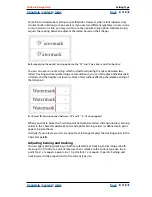
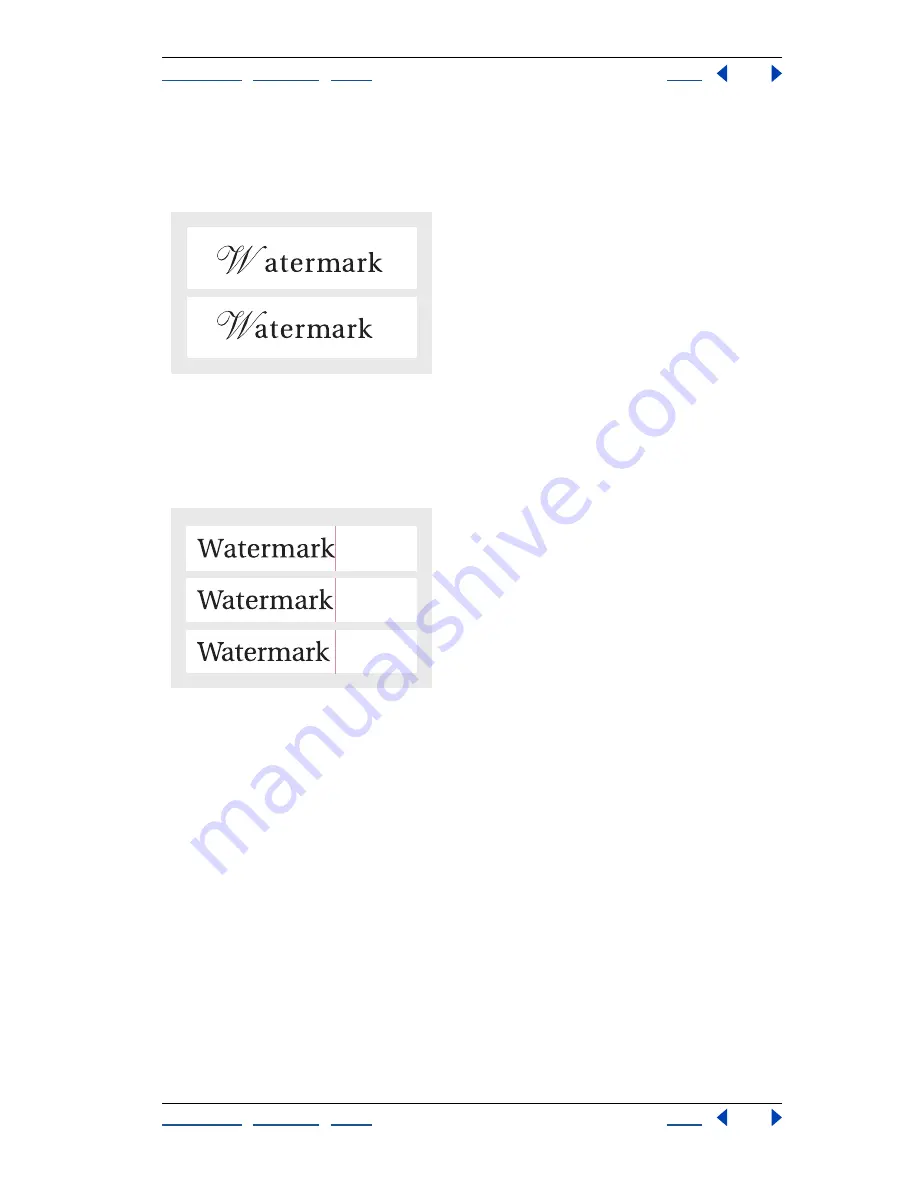
Before applying the optical kerning option to the “W” and “a” pair (top), and after (bottom)
You can also use
manual kerning,
which is ideal for adjusting the space between two
letters. Tracking and manual kerning are cumulative, so you can first adjust individual pairs
of letters, and then tighten or loosen a block of text without affecting the relative kerning of
the letter pairs.
A.
Original
B.
Kerning applied between “W” and “a”
C.
Tracking applied
When you click to place the insertion point between two letters, InDesign displays kerning
values in the Character palette. Metrics and optical kerning values (or defined kern pairs)
appear in parentheses.
Similarly, if you select a word or a range of text, InDesign displays the tracking values in the
Character palette.
Adjusting kerning and tracking
You can apply kerning, tracking, or both to selected text. Tracking and kerning are both
measured in 1/1000 em, a unit of measure that is relative to the current type size. In a 6-
point font, 1 em equals 6 points; in a 10-point font, 1 em equals 10 points. Kerning and
tracking are strictly proportional to the current type size.
A
C
B


