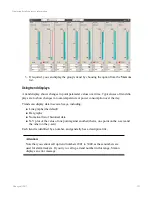
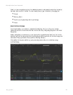
Like standard trends, limit trend data is shown as a line graph. The target range for a point is
shown as a gray shaded area. If a point exceeds the target range, the part of the plot outside
the limit is bold and the exceedance is shown as a shaded area of the same color.
Tip:
To avoid confusion, alarm colors should not be used as plot colors.
As with standard trends, you can click an area of the trend to add a reference line that shows
values for the plots and limits at a specific point in time. If the legend is visible when you add
a reference line, the legend will contain the reference values for each point in the trend. You
can also mouse over the trend to obtain the reference values.
Selecting a plot will show limits that have been configured to
Plot on trend
. To see the
values for all the types of limits configured for a point, click the plot for the point and select
Advanced limits
. For more information about how to do this, see “Limit trend controls.”
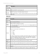
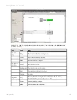
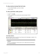
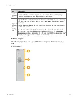
Limit trend controls
Limit trends are designed so an operator can change the way information is displayed directly
in the limit trend display. When viewing limit trends in Station, use the various controls on the
display to change the trend. The following table describes the controls that are available on
the default limit trend.
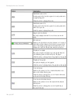
Control
Description
Individual scales in
EU
Scaling used in the trend is separate for each point and is in engineering
units.
Click the arrow to change the scale.
Individual scales in
%
Scaling used in the trend is separate for each point and is shown as a
percent.
Click the arrow to change the scale.
Single scale for all
plots
The range displayed on the Y-axis is the same for all plots.
Click the maximum and minimum values in the y-axis to change the scale.
Auto Scale all
The range shown on the y-axis is determined automatically.
Auto Scale
selected
The range shown on the y-axis for the selected plot is determined
automatically.
Auto scale stacked
The range shown on the y-axis is determined automatically so that all plots
are separated into horizontal strips and the data currently visible does not
overlap.
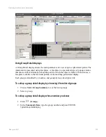
Displaying detailed process information
Honeywell 2017
226
Содержание Experion LX
Страница 1: ...Experion LX Operator s Guide EXDOC XX80 en 500A April 2017 Release 500 ...
Страница 77: ...Button Description toolbar Using faceplates Honeywell 2017 77 ...
Страница 249: ...n Restart n Hold n Stop n Abort n Resume n Active n Cancel About activities batches and procedures Honeywell 2017 249 ...


