Widgets and Creating GS Screens
Graphical Status Screens/Floor Plans • 111
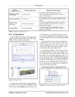
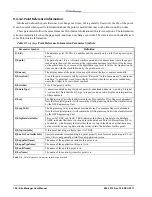
This means that when GsImageCircuitStatus and
GsZoneCircuitStatus widget types are newly added,
when clicked, they will go to the most obvious place
by default (the Standard Circuits graphical status
screen for the application on the first point reference
on the widget.)
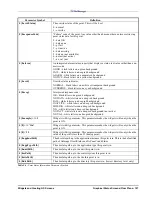
Text and Table Widgets
For text and table widgets, some of the text fea-
tures you will see on-screen are listed in the Text Fea-
ture column. The options you can enter manually are
listed in the Options column.
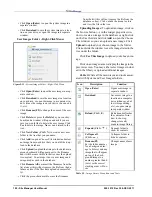
Choose images to build GS Screens from the Im-
age Library by clicking the browse icon (...) and
choosing from the directories. You can also create
your own directories.
The GS Table widget has a “Column Widths” fea-
ture so that the width of each column can be set man-
ually. This list is a comma-separated list of pixel
widths for each column. Each column can have its
visibility controlled if the header item for that column
has a reference to a point reference and that point ref-
erence is not visible.
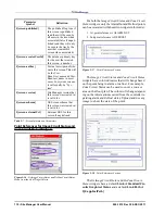
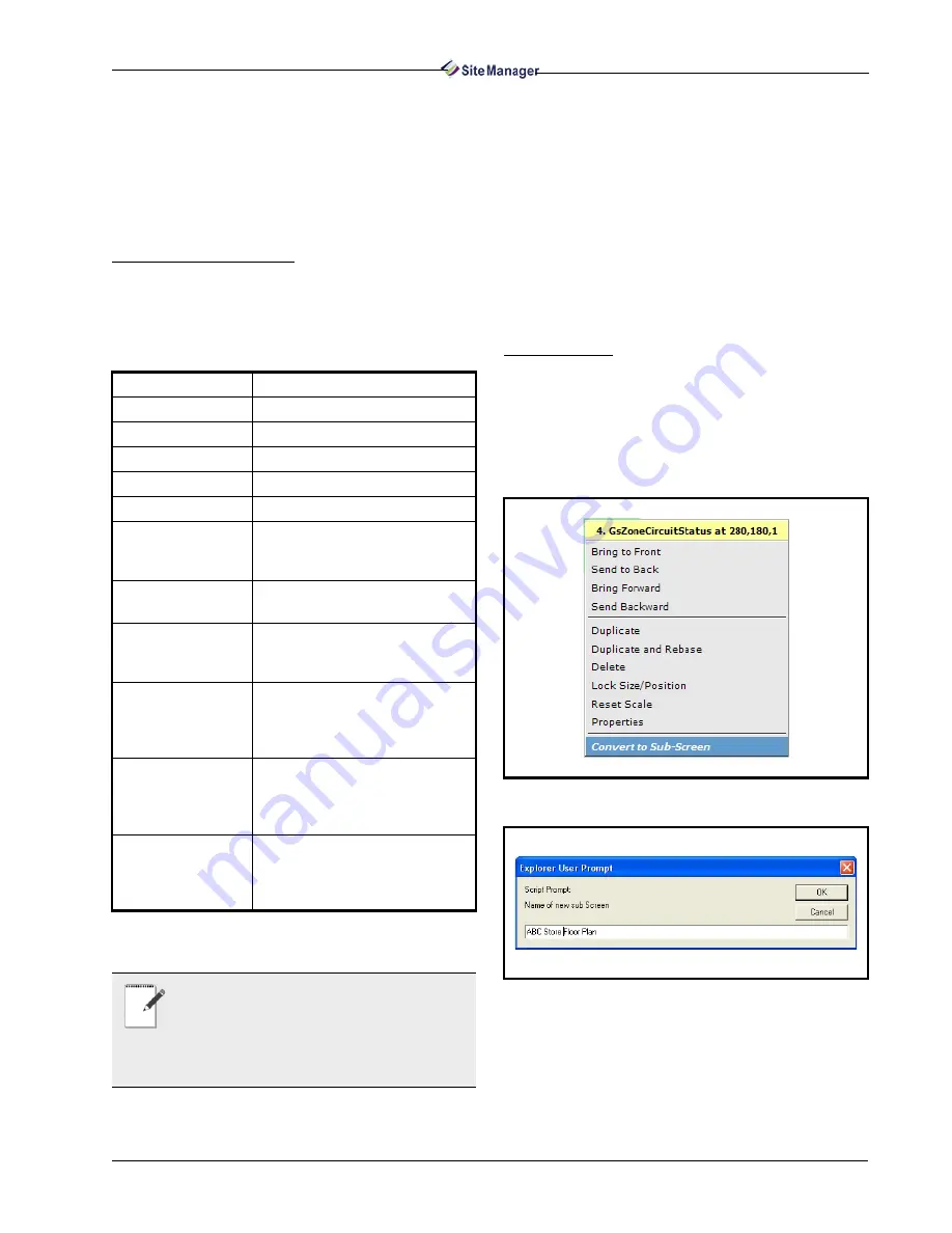
Zone Widgets
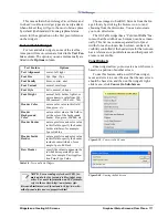
Zone widgets allow you to create a new GS screen
based on a portion of another screen.
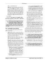
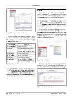
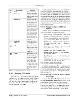
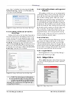
To use this feature, add a new GSZone widget,
move and size it to cover the area that the new screen
should be based on, and then on the widget’s right-
click menu, click Convert to Sub-Screen.
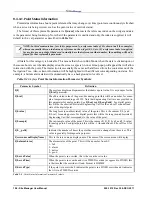
Text Feature
Options
Text Alignment
center, left, right
Font Size
9px, 10px, 12px
Font Family
times, courier, arial
Font Variant
normal, small caps
Font Style
italic, normal, oblique
Font Weight
normal, bold, bolder, lighter, or
enter a numeric value from 100 -
900 (normal = 100, bold = 700)
Header Color
enter a color value in this field:
blue, green, etc.
Header
Background
Color
enter a color value in this field to
set the color of the background
header: blue, green, d0d0d0, etc.
Header Border
enter a pixel size and color value
in this field to specify the header
border attributes, for example:
2px solid blue
Header Inside
Border
enter a pixel size and color value
in this field to specify the header
inside border attributes, for ex-
ample: 1px solid black
Row Header
specify the values to appear in the
row header separated by com-
mas, for example: Unit,Applica-
tion,Point,Type,Value
Table 9-8 - Text and Table Widgets
NOTE: Use cascading style sheet (CSS) for-
mats and rules for text and table widget prop-
erties. For more information on CSS formats,
refer to these sites: http://www.javascript-
kit.com/dhtmltutors/css5.shtml and/or http://www.ht-
mlhelp.com/reference/css/properties.html
Figure 9-39 - Convert to Sub-Screen
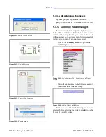
Figure 9-40 - Naming the Sub-Screen
Summary of Contents for Site Manager
Page 1: ...026 1012 Rev 3 06 DEC 2011 Site Manager User Manual ...
Page 2: ......
Page 4: ......
Page 124: ......
Page 129: ......

