Exinda Network Orchestrator
3 Using
|
221
same time.
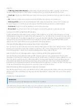
Traffic Type (Inbound/Outbound):
By default, both Inbound and Outbound traffic is graphed. Click either the
Inbound or Outbound option to hide the data, including all the carts and the data tables below the charts.
Chart Type:
Toggles on or off the time series charts and allows selecting stacked area display versus a line chart dis-
play.
Pie:
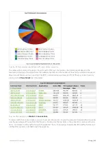
Toggles on or off a colour-coded Pie chart to the left of the Top Listeners and Top Talkers list.
Remaining Traffic:
Append or hide the Remaining Traffic category below the Top Listeners and Top Talkers lists.
This option toggles on or off the presence of a category for all the remaining applications summed together.
Data Details:
Toggles on or off the data tables below the time series charts.
Mouse Hover:
Hover the mouse pointer over the graph to view data throughput at a given date and time.
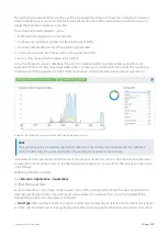
Turning on or off the remaining traffic category
Toggle the Remaining Traffic button on the button bar. When toggled on, a grey chart series will appear in all charts
(throughput, pie, top applications) representing all the applications on your network that are not explicitly represented
in the top applications. If the remaining applications show vastly more data volume than the top applications, then the
top applications may look insignificant relative to the total, and so you may need to toggle off the remaining traffic
category to see the relative differences and usage patterns of the top applications.
Changing the throughput chart to stacked area charts or line charts
Press the down arrow next to the dropwdown list at the top of the page and choose which chart type to show. The line
chart shows the applications against the common zero baseline so they can be compared to each other and the pattern
of a specific application is clearer. You can look for particular patterns such as spikes or flat tops.
Determining if one or more applications may be choking out the other application traffic
View the throughput charts with the remaining traffic category toggled on. For any periods where the cumulative
throughput is especially high (compared to the pipe size that this appliance is managing) is there an application or two
that is consuming a significant portion of the bandwidth. If so, that application may be choking out other application
and would be a candidate for control. Please note that you many need to go to the virtual circuit chart and filter the
applications by the individual virtual circuits to understand whether an application is choking out others since the virtual
circuits share bandwidth and an application my overrun one virtual circuit but not others.
Determining if any of the top applications appear to be limited
View the throughput charts as a line chart with the remaining traffic category toggled off. If any of the lines representing
the applications have raised flat tops, this may represent that the application is being limited by a policy or the capacity
of your pipe.
Charting any single application
VERSION INFO
Filtering to show any single application is available in 7.0.1 and above.
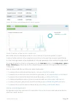
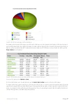
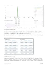
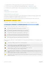
In the data table, each application has a filter icon on the right-hand-side of the row. By clicking on the filter icon, as
shown below for Google Encrypted, only the selected application will be charted.
Summary of Contents for EXNV-10063
Page 369: ...Exinda Network Orchestrator 4 Settings 369 ...
Page 411: ...Exinda Network Orchestrator 4 Settings 411 Screenshot 168 P2P OverflowVirtualCircuit ...
Page 420: ...Exinda Network Orchestrator 4 Settings 420 Screenshot 175 Students OverflowVirtualCircuit ...


