


214
Chapter 9: Using Flash, Flash Components, and Other Interactive Media Types
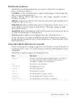
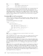
Property summary for the DateChooser class
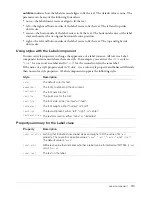
Event summary for the DateChooser class
Label component
A label component is a single line of text. You can specify that a label be formatted with HTML.
You can also control alignment and sizing of a label. Label components don’t have borders, cannot
be focused, and don’t broadcast any events.
Use a Label component to create a text label for another component in a form, such as a “Name:”
label to the left of a TextInput field that accepts a user's name. If you’re building an application
using components based on version 2 (v2) of the Macromedia Component Architecture, it’s a
good idea to use a Label component instead of a plain text field because you can use styles to
maintain a consistent look and feel.
Label parameters
The following are authoring parameters that you can set for each Label component instance in
the Property inspector or in the Component Inspector panel:
text
indicates the text of the label; the default value is Label.
html
indicates whether the label is formatted with HTML (
true
) or not (
false
). If the
html
parameter is set to
true
, a Label cannot be formatted with styles. The default value is
false
.
Method Description
DateChooser.dayNames
An array indicating the names of the days of the week.
DateChooser.disabledDays
An array indicating the days of the week that are disabled for all
applicable dates in the date chooser.
DateChooser.disabledRanges
A range of disabled dates or a single disabled date.
DateChooser.displayedMonth
A number indicating an element in the
monthNames
array to display in
the date chooser.
DateChooser.displayedYear
A number indicating the year to display.
DateChooser.firstDayOfWeek
A number indicating an element in the
dayNames
array to display in
the first column of the date chooser.
DateChooser.monthNames
An array of strings indicating the month names.
DateChooser.selectableRange
A single selectable date or a range of selectable dates.
DateChooser.selectedDate
A Date object indicating the selected date.
DateChooser.showToday
A Boolean value indicating whether the current date is highlighted.
Method Description
DateChooser.change
Broadcast when a date is selected.
DateChooser.scroll
Broadcast when the month buttons are pressed.
Summary of Contents for DIRECTOR MX 2004-USING DIRECTOR
Page 1: ...DIRECTOR MX 2004 Using Director...
Page 16: ...16 Chapter 1 Introduction...
Page 82: ...82 Chapter 3 Sprites...
Page 98: ...98 Chapter 4 Animation...
Page 134: ...134 Chapter 5 Bitmaps...
Page 242: ...242 Chapter 10 Sound and Synchronization...
Page 274: ...274 Chapter 11 Using Digital Video...
Page 290: ...290 Chapter 12 Behaviors...
Page 302: ...302 Chapter 13 Navigation and User Interaction...
Page 334: ...334 Chapter 15 The 3D Cast Member 3D Text and 3D Behaviors...
Page 392: ...392 Chapter 16 Working with Models and Model Resources...
Page 418: ...418 Chapter 18 Movies in a Window...
Page 446: ...446 Chapter 22 Managing and Testing Director Projects...