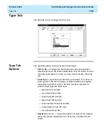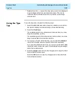
Format | Chart
CentreVu Report Designer Version 8 User Guide
Axis Tab
12-7
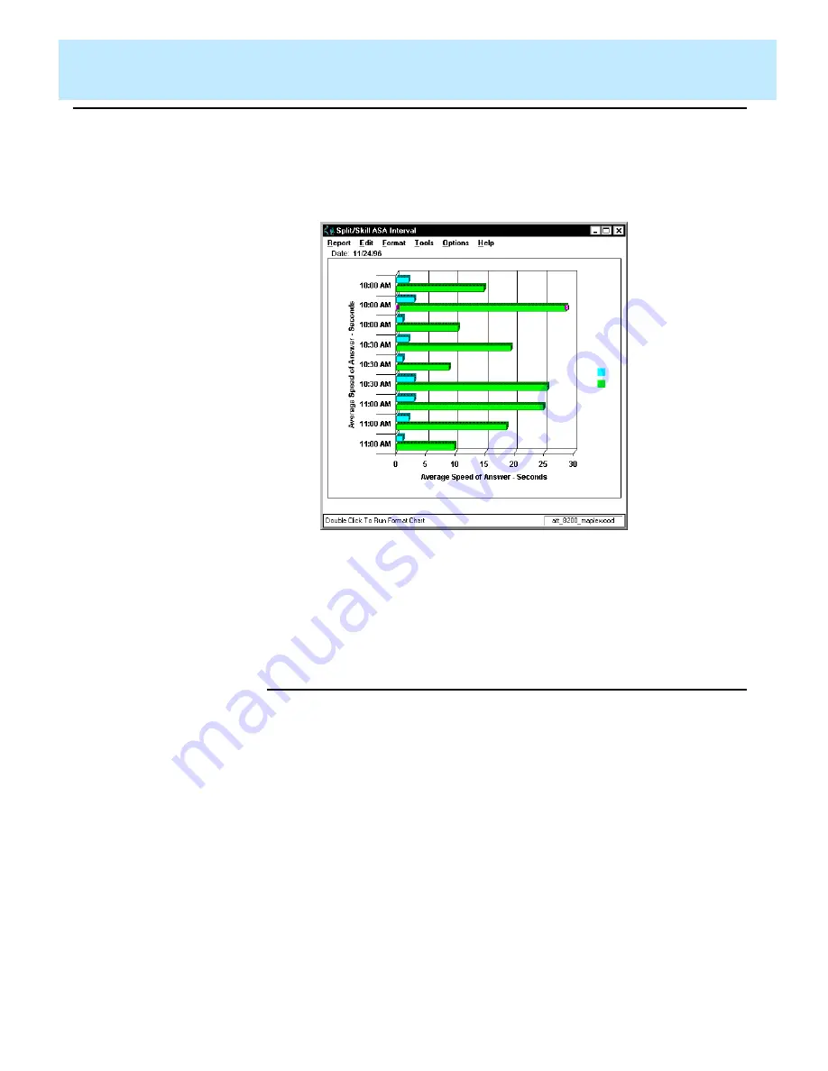
The previous example showed a report with One Data Value per
Row selected. Following is an example of the same report, using the
same Category item (STARTTIME), without One Data Value per
Row selected.
In the first example, you can see that the report shows one “row” of
data for the interval beginning at 10:00 AM, one “row” of data that
includes information for each split/skill for the interval beginning at
10:30 AM, and one “row” of data for the interval beginning at 11:00
AM. In the second example, there is a “row” of data shown for each
split/skill for each interval.
Using the Axis
Tab
12
To use the Axis tab, complete the following steps:
1. Depending on the type of chart (bar, line, area, step, clustered bar,
horizontal bar, or pie, as selected on the Type tab) you are
formatting, select the appropriate Axis check box.
2. Type the Title you would like assigned to the axis in the appropriate
text box.
3. In the Category for X-Axis box (same as the Available Items box in
the Insert Query Chart Assistant), select the database item that you
would like to use as the category for the chart. The Category is
usually “none” for real-time charts, or a time database item for
historical charts.
Summary of Contents for CentreVu Report Designer
Page 4: ......
Page 18: ...Introduction CentreVu Report Designer Version 8 User Guide Related Documents 1 8...
Page 102: ...Edit Inputs CentreVu Report Designer Version 8 User Guide Viewing the Input Window 6 16...
Page 198: ...Format Text CentreVu Report Designer Version 8 User Guide Formatting Text on the Report 15 4...
Page 264: ...Index CentreVu CMS R3V8 Upgrades and Migration IN 10...
Page 266: ......

