KNX control elements and application parameters
Control element "Rocker switch"
Product manual 2CKA001473B5342
│
121
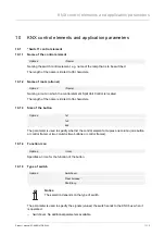
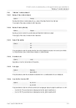
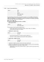
Options:
<Text>
The entered text is displayed when the rocker (button) bottom is actuated.
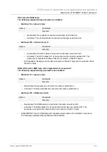
Text for top / Value 2
:
Options:
<Text>
The entered text is displayed when the rocker (button) top is actuated.
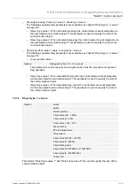
10.2.6 Status control element (icon/text) is operated via a separate object
Options:
No
Yes
An additional 1-bit communication object "Status" is enabled via the parameter.
When the object has been enabled, the status display of the control element indicates the
current status of the object. The feedback signal object can ensure that the correct status is
always displayed.
If an actuator has a separate feedback object, this additional object can check whether the
actuator has switched. For this the feedback object of the actuator must be connected with the
feedback object of the button via a common group address (Action).
If the status display is not activated via a feedback object, the control element always changes
to the other status when actuated.
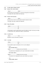
10.2.7 Additional status text for value
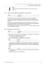
Notice
This additional status text is only displayed when normal control elements are
used, but not for reduced control elements.
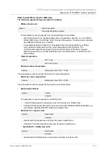
Additional status text for value 1
:
Options:
<Text>
The entered text is displayed for value 1.
Additional status text for value 2
:
Options:
<Text>
The entered text is displayed for value 2.
Notice
Value 1 corresponds to button top
Value 2 corresponds to button bottom
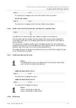
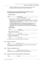
10.2.8 Object
type

