


The effect of HRng
Grouped data & HWidth
The effect of
HRng
is rather different. It controls what range of data is
displayed on the graph, regardless of what axes are used. It is normally
set automatically to be the maximum and minimum values for the data.
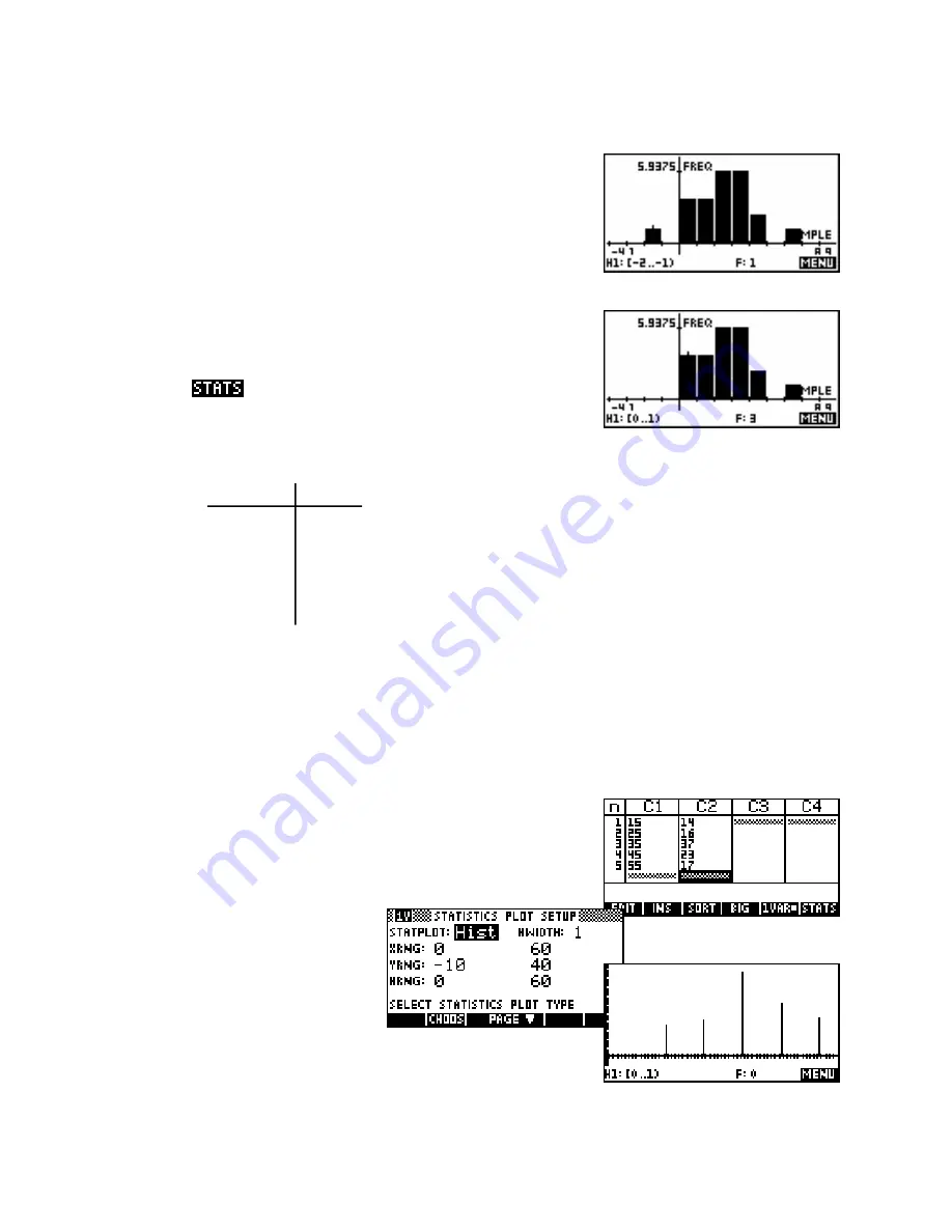
For example histogram
H1
(shown right) has an
HRng
of -2 to 7. If
HRng
were changed in
PLOT SETUP
to 0 to 7 then the graph will lose
the left column representing the value of -2 as shown below.
The advantage of this is that it allows you to eliminate outliers from your
graph quite easily. However, eliminating them from your graph does
not eliminate them from inclusion in the calculation of the values that
appear in the
page. To do that you would need to delete the
actual data itself.
data
freq
One final note concerns grouped data. We saw earlier
how to deal with data displayed in a frequency table, but
10 - 19
14
did not deal with the case where the data was also
20 - 29
26
grouped into intervals or classes.
30 - 39
37
40 - 49
23
For example, suppose we want to analyze the set of
50 - 59
17
grouped data in the table on the left.
As with most calculators, the hp 39gs & hp 40gs provide only limited methods to deal with data of this form.
Summary statistics can be obtained by entering the mid-points of the intervals as the data values but these will
only be approximations, as nature of the data itself does not allow calculation of exact values.
The problem with using the mid points is that attempting a normal
PLOT
will produce a series of isolated columns, each with width one unit. The
reason for this is that the calculator is assuming that there are 14 values
of exactly 15 (the mid-point) because it doesn’t realize that the columns
extend the width of the interval 10 - 19.
However this can be fixed by using the
setting
HWidth
as outlined on the next
page.
118