9 LTOS7 Management and Monitoring
9.1.7 Statistics
9.1.7.1 NTP Performance Graph
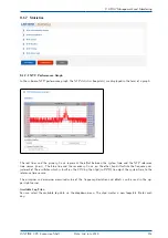
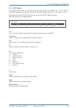
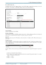
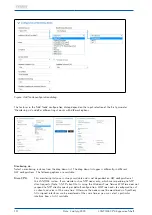
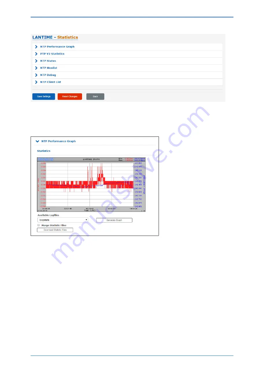
In the submenu NTP performance graph, the NTP statistics (loopstats) are displayed in the form of a graph.
The red lines and the primary Y-axis represent the offset between the system time and the NTP reference
time source (in ms). The blue line and the secondary Y-axis, on the other hand, illustrate the frequency ad-
justment of the oscillator which is built on the CPU by the ntpd (in PPM), to adjust the system time to the
reference time source.
The minimum and maximum measured value of the frequency deviation and offsets can be read in the up-
per right corner.
Available Log Files:
You can select the available log data via the dropdown menu. The ntpd creates a new loopstats file for each
day.
LANTIME CPU Expansion Shelf
Date: 2nd July 2020
103

