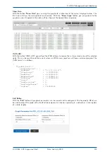
The monitoring engine will start to send PTP/NTP requests in the configured intervals to each node from the
list and measure the time received in the responses with its own time (which is traceable to UTC, GNSS sync
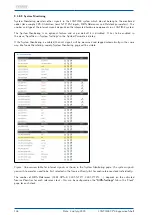
for example). The current offset and status information can be checked in the status overview table in the Node
Monitoring menu.
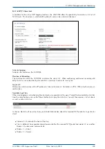
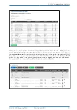
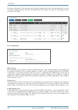
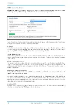
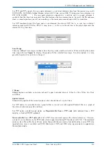
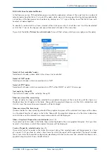
In the status overview table of monitored nodes, next to the status information you will find 3 action but-
tons: Graph, Error Logs and Edit.
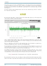
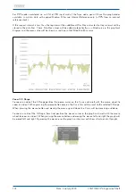
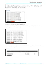
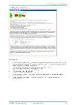
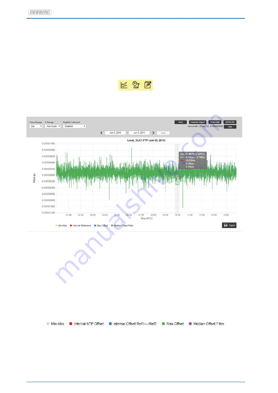
By selecting the Graph button a Graphical Diagram for the selected node will show up. At this page you find
several features for different representation options.
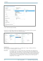
Figure: Graphical diagram of offset values for each node, selectable for different time ranges (day, week,
month or manual selection). With given buttons at the "Select Time Range" you can select either past or future
intervals for the graphical representation.
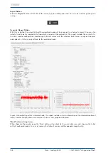
Offsets are collected for each NTP/PTP or other monitored node and can be depicted as graphical repre-
sentation for selectable time intervals in the web UI of the SyncMon node.
The monitored data are continuously saved on the Sync node "Base Path for logfiles for current day" and
will be saved automatically to the Flash Card (’Base Path for logfiles for history of days’) at change of a day
at 0:00 UTC. Data are available at any time for further statistic processing.
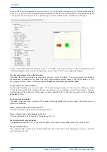
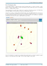
At the bottom of the graph an overview will show which color will represent which data. In this case the
red line represents the internal NTP Offset, which is the reference for the monitored NTP node. The green line
is the offset between a Sync node reference time and the measured time of a monitored device.
By positioning the cursor to one item in the bottom line then only that graph will be displayed and all other
graphs will be shown in light color. When clicking to one item in the bottom line then this graph will be hided.
122
Date: 2nd July 2020
LANTIME CPU Expansion Shelf


