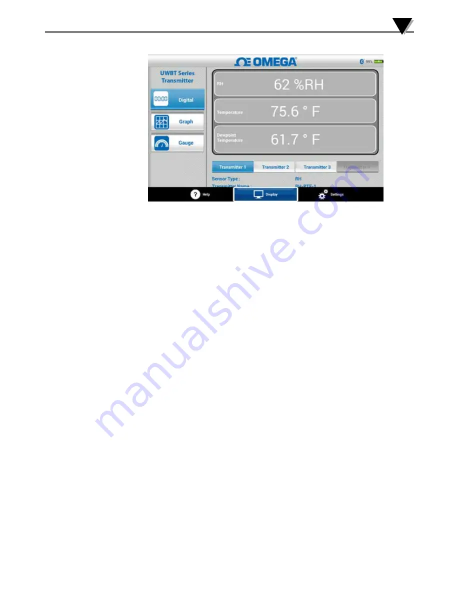
Figure 5-5. Digital RH Display
5.2.2 Graph Format
The transmitter data can be displayed in graph format. There are 3 options for
the graph format:
• Live Graph
• Playback Graph
• Download from Transmitter
Live Transmitter Data
The live graph shows data as it is being captured by the transmitter. The
measurement value is shown with a white line. For RH graphs, the temperature
is shown with a white line (left Y-axis), and the RH percentage is shown with a
green line (right Y-axis).
The high alarm value is displayed with a constant red line. The low alarm value
is displayed with a constant blue line. If an alarm sound has been selected, the
sound will be activated when the current value goes above the high alarm line,
or below the low alarm line.
When connected to multiple UWBT transmitters, you can select which
transmitter you are viewing directly from the current display screen. Click on
the button labeled “Transmitter 1” and so on, and you can view the selected
transmitter’s data.
At the bottom of the Live Graph screen, you have the option to either allow the
app to automatically scale the Y-axis, or set the parameters on your own. Auto-
Scaling allows you to always see your data line, on the screen. To manually set
the y-axis scaling, simply un-check the box labeled “Y-Axis Auto Scaling”, and
enter the preferred values.
You can record the live data directly from this screen. At the bottom half of the
Live Graph screen, hit the “Start Logging” button. The data will be logged to the
smartphone/tablet. While logging, the top left of your screen will show “REC”
as a reminder.
Software Instructions (Android)
5
5-6


