BAPPU-
evo
Multi-measuring device for workplace analysis
10.8. Display options for the graphs
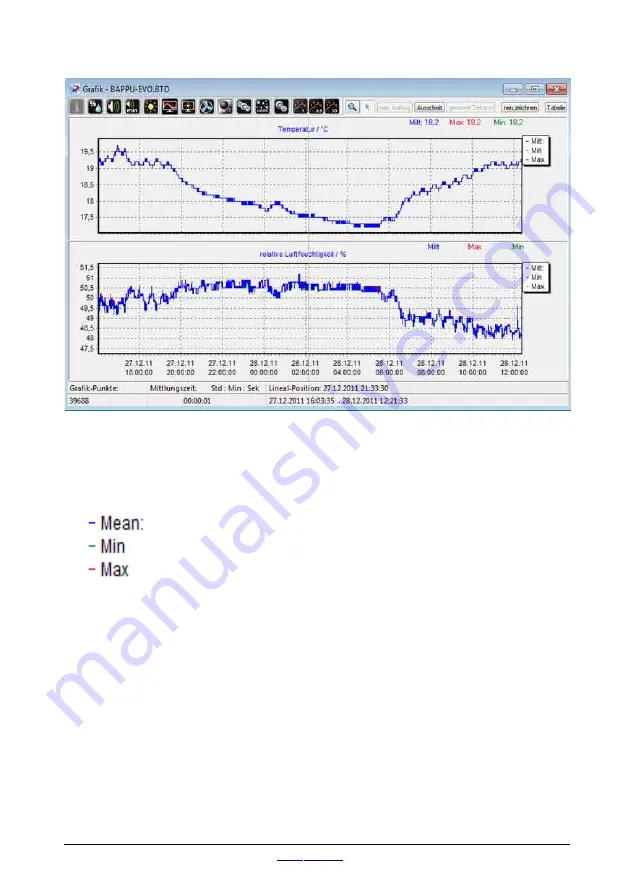
The white box at the top right hand side of the window shows the colour legend used
for presenting curves. They can be displayed separately by clicking on the
abbreviation in the white box or on the header.
Display the average value with a blue curve
Display the minimum value with a green curve
Display the maximum value with a red curve
Tip:
Tip:
If you encounter problems displaying the data,
select “View/new graph” in the menu list or press the
“New graph” button.
Specific selection
If you want to analyse a specific part of the graph, all you need to do is enter the
time of the beginning and end of the specific area in the “Detail” dialog box. The
selection criteria will shrink the timeline of the graph to the time you require.
page 40
status 07/2019
Summary of Contents for BAPPU-evo
Page 1: ......
Page 2: ...EN The original operating manual is in German Status 08 2019...
Page 51: ......


