User Interface
16
Graph Types
Any power measurement on the readings menu may be displayed on a graph.
See
"How to Display a Graph" on page 16
. Graph setup may also be saved so
frequently used settings will automatically be selected.
Note:
Graphs are saved for the mode only. If the mode is changed the
saved graph will not be available, until the device/mode associated
with the saved graph is reconnected. Graphs can be saved for other
devices of the same type by saving a Default Preset.
Time Graph —
The time graph displays signal measurements over time. The x-
axis displays the time of the reading, the y-axis displays the measurement value.
The graph is limited to 2000 data collection points, once the graph reaches this
limit the oldest data is discarded as new data is added, so the chart data will
constantly be shifting to the left side of the screen. See
for detailed information on interacting with Time Graphs.
Bar Graph —
The bar graph displays instantaneous power levels of one or
more signal measurements. The x-axis displays the name of the reading, the y-
axis displays the measurement value. The graph initial setting is a single bar, but
additional bars may be added. See
"Bar Graph Controls" on page 17
for
detailed information on interacting with Bar Graphs.
Data Graph —
Power CCDF and Time Domain measurements are displayed on
a Data Graph. The results are displayed following a measurement and continue
to be displayed until a new scan is triggered. See
for detailed information on viewing Data Graphs.
Note:
Data Graphs are not available on all sensors.
How to Display a Graph
1. Tap the Display Controls Menu
to display the graph options.
2. Tap the name of graph type you wish to display (New Bar, New Time, New
Data Set).
Note:
It is recommended a descriptive name be used as graph names,
including graph type and other distinguishing information, since
multiple graphs may be saved.
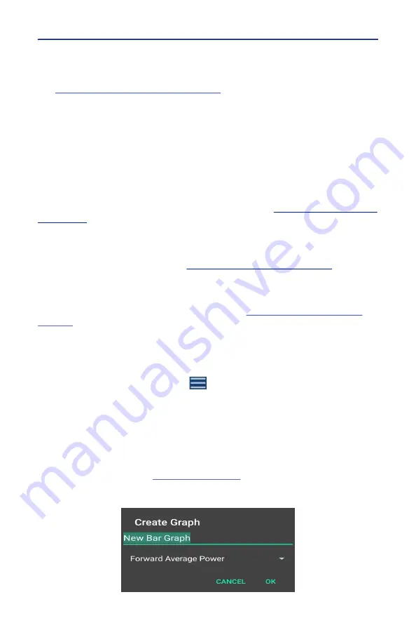
3. Tap the name of the graph in the Create Graph Dialog a replace it with a
descriptive name. See
.
Figure 8 Rename New Graph


