The Timeline View
ARM DUI 0482K
Copyright © 2010-2012 ARM. All rights reserved.
6-14
ID120712
Non-Confidential
Figure 6-20 A stack chart example
Stacked charts are appropriate when the events are counted in exactly
one of the series in a chart. For example, this is useful in a case where
a chart contains both Data Read Hits and Data Read Misses.
Overlay
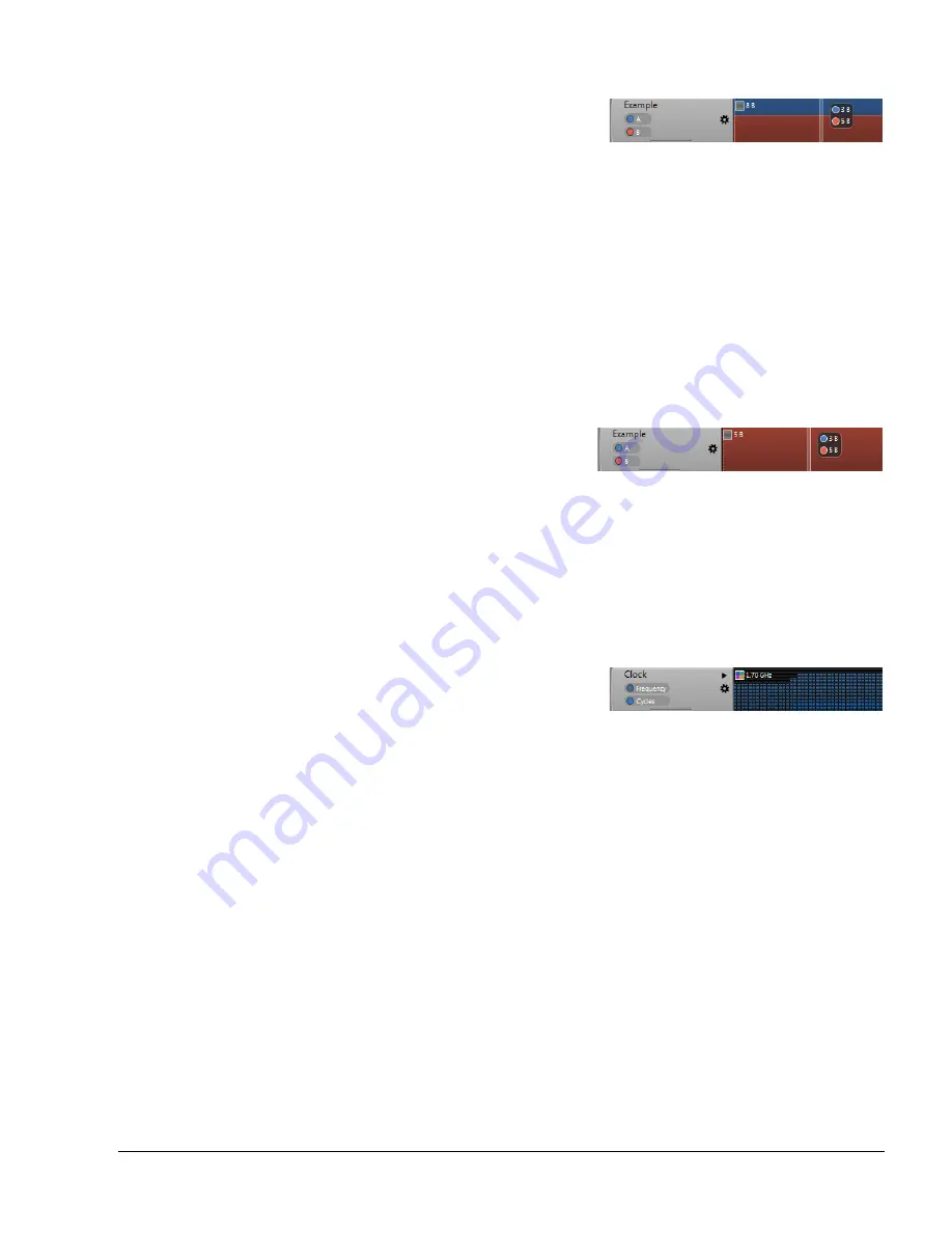
An overlay chart contains a line for each series defined in the chart
control. The area below the line is filled with the color defined in the
series control for each data set. Series higher in the chart control appear
behind series that are lower in the chart control. So if series A is the
first series in a chart control and has a value of three and series B
appears second in the chart control and has a value of five, this value
from series A is obstructed from view by the larger value of series B.
For this reason, it is important to place higher value series higher in the
chart control when using an overlay chart. Drag and drop series
controls to reorder them.
Figure 6-21 Data from series A obstructed by data from series B
Overlay charts are appropriate when some of the events are counted in
more than more series in the same chart. Data Read Requests and Data
Read Hits are a good example of this.
Bar
In a bar style chart, each bin in the chart is represented by a colored bar.
Like the stack view, values from higher series are stacked on top of
values from lower series and the total bar height represents the
aggregate.
Figure 6-22 A bar chart example
Title
Use this field to give the chart a title. The title appears at the top of the handle for
the chart in the Timeline view.
Average Selection
When you have this option checked, any selection you make using the Cross
Section Marker shows the average value of all bins included in the selection. If
unchecked the overlay is a total value of all bins.
Average Cores
When you have this option checked, values in a multi-core chart are the average
of the individual cores when you have not used the multi-core disclosure control
to show per core data. If you have not checked this chart control option, the
multi-core chart shows the totals from all cores.
Percentage
In a percentage style chart, values are plotted as percentages between 0 and 100
percent. The maximum value in the chart represents 100% in a percentage chart
and all other values are compared to that number to calculate a percentage.


