Promega Corporation · 2800 Woods Hollow Road · Madison, WI 53711-5399 USA · Toll Free in USA 800-356-9526 · 608-274-4330 · Fax 608-277-2516
55
www.promega.com
TM397 · Revised 12/16
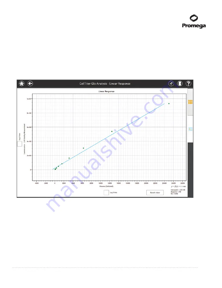
i. After the analysis has been run, touch the
Graphing Tab
on the right side of the screen to view the
graph of the results.
j. Adjust details on the graphing tab to modify the appearance of the graph. Use the checkboxes for
Log
X-Axis
and
Log Y-Axis
to specify whether the desired axis should be displayed as a log scale. Touch
Graph title
,
X axis title
or
Y axis title
to change the name of the selected title. Use tablet gestures to
zoom in or pan the graph (pinch to zoom out, reverse pinch to zoom in, swipe to pan). Touch the
Reset
View
button to return the graph to the default display (Figure 57).
Fi
13896T
A
gure 57. Graphing of analyzed data.
After selecting the
Run
button to analyze an experimental data set, the
graphing tab on the righ side of the screen becomes active. Touch the graphing tab to view analysis results. From
this tab, Axes can be displayed as linear or log format, axis and graph titles can be modified, and the graph can be
panned or zoomed. Touch
Reset View
to return the graph to the default view.
Outliers can be excluded by touching the outlier point in the data tab, and then touching the
Exclude
button.
After excluding outliers, touch the
Run
button to reanalyze the data with outliers removed.
Once you are satisfied with the results of the analysis, touch the Save Analysis button to save this analysis
with a user-specified name within the list of Analyses on the ‘Analyses’ screen.
If you have made any changes to the analysis template that you wish to save, touch the
Save Template
but-
ton. Specify a name for the template (using the same name will overwrite the existing template; a new name
will create a new template).


