XEVO
Software Manual
Dashboard Tab and QSLife
© 2022 QSAN Technology, Inc. All rights reserved.
www.qsan.com
Official
Document
19
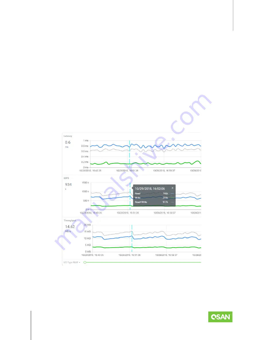
Bandwidth:
The Bandwidth graph displays the number of bytes transferred per second to
and from all hosts. The data is counted to reflect what is transferred over the storage
network. The
blue
line represents the number of bytes read per second. The
green
line
represents the number of bytes written per second. The dotted
gray
line represents the
number of bytes read+written per second.
The performance graphs display the performance metrics in real time along with a scrolling
graph; the incoming data appears along the right side of each graph as older numbers drop off
the left side. Click the I/O Type drop-down arrow in the bottom-left corner of the window to
filter the performance metrics of read, write, or read+write. By default, the performance graphs
display performance metrics for the past 1 hour. Click the Zoom drop-down arrow in the
bottom-right corner of the window to view performance metrics from as recent as 1 hour to as
far back as 1 year. Drag the Range buttons to further narrow the view to a specific range of time.
Figure 4-2 Performance Indicator in Dashboard
Hover your mouse over the line and click to display the point-in-time performance indicator. It
shows the detailed number of read, write, and read+write. Clicking the "x" on the upper right
corner will turn off the indicator.


