30
12.18.
Charts
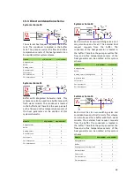
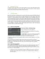
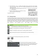
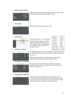
The visualization can display up to three different charts. Line charts represent data from the data
logger whereas bar charts visualize statistical data.
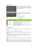
Designation
Meaning
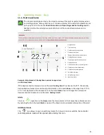
Previous Interval
, e.g. in the yearly view the previous year will be shown
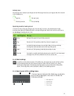
Next Interval
, e.g. in the yearly view the next year will be shown
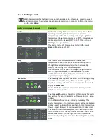
Zoom in
, e.g. from the yearly view will be changed to the monthly view
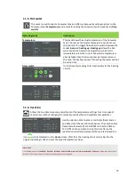
Zoom out
, e.g. from the monthly view will be changed to the yearly view
A bar chart supports:
zoom levels for a year (12 months)
a month (4-5 calendar weeks)
512 MB flash a week (7 days)
A line chart supports:
zoom levels for a year (12 months)
a month (4-5 calendar weeks)
a week (7 days)
a day (24 hours)
When the chart area gets clicked, a tip regarding the respective values of the single data sources will
be shown.
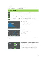
Chart configuration
The configuration mask lists all available data sources which
can be added to the chart by activating it via the slider.
Each chart can contain up to five data sources with two
different units. All further data sources will be removed. If a
data source from one kind is selected, all data sources from
the other kind will be removed from
the
mask. By pressing
the "Save" button, the selected configuration is saved.

