31
Mosquito Maps
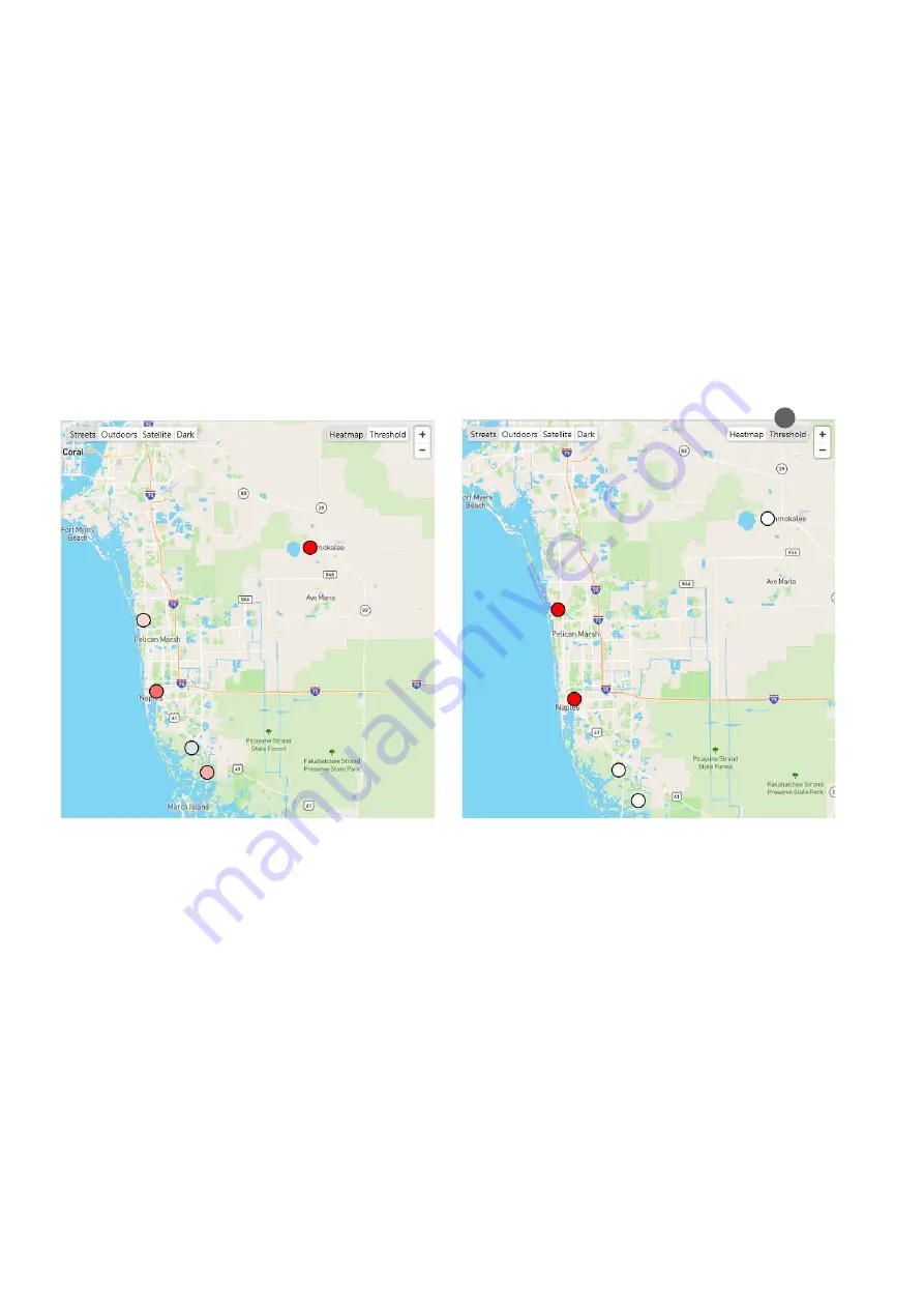
When analyzing multiple locations, a group, or multiple groups, the mosquito
heatmap
and the
threshold map
complement
your analysis by showing you the locations with high (or low) catch counts, or the locations with a catch count above threshold.
Heatmap
The heatmap is a map that shows the relative density of mos-
quitoes at each location. The map works for all time ranges
and shows the
mean number of mosquitoes per day
for each
location.
When selecting multiple locations, a group, or multiple
groups in the Analyzer overview table, you‘ll automatically
see this heatmap additionally to the line chart and the table.
Threshold map
To access the threshold map, you have to click on
“Threshold”
(37) in the top right corner of the heatmap.
The threshold map shows, which of your locations are
above
threshold
. This map also works for all time ranges.
When the selected time range is longer than 1 day, a location
is considered as “above threshold”, when the mean catch per
day is above the defined mosquito catch index threshold.
The heatmap is available for mosquitoes, small objects, and
large objects.
•
Red
circles
(in different shades of red): Mosquitoes were
collected at the location. The darker red the circle, the
more mosquitoes were counted.
•
White circles
refer to zero mosquitoes.
•
Grey circles
appear, when there is no data available for
a certain locations during the selected time range. This
happens for example, when the BG-Counter was turned
off, or moved to another location.
The threshold map is only available for mosquitoes.
•
Red circles
refer to a location
above threshold.
•
White circles
indicate a location
below threshold
.
•
Grey circles
indicate that there is
no data availble
. That
can happen when there is no threshold defined for this
location, when the BG-Counter was turned off during the
selected time range, or when there is currently no BG-
Counter on this position.
To set a threshold for your locations go to the settings page
that you can reach through the dashboard.
37


