20.2 Interface statistics
253
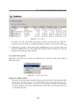
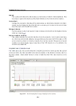
The period (
2 hours
or
1 day
) can be selected in the
Time interval
box. The selected time range
is always understood as the time until now (“last 2 hours” or “last 24 hours”).
The
x
axis of the chart represents time and the
y
axis represents traffic speed. The
x
axis is
measured accordingly to a selected time period, while measurement of the
y
axis depends on
the maximal value of the time interval and is set automatically (bytes per second is the basic
measure unit —
B/s
).
Select an option for
Picture size
to set a fixed format of the chart or to make it fit to the
Administration Console
screen.
The legend above the graph shows the sampling interval (i.e. the time for which a sum of
connections or messages is counted and is displayed in the graph).
Example
Suppose the
1 day
interval is selected. Then, an impulse unit is represented by 5 minutes.
This means that every 5 minutes an average traffic speed for the last 5 minutes is recorded in
the chart.
Summary of Contents for KERIO WINROUTE FIREWALL 6
Page 1: ...Kerio WinRoute Firewall 6 Administrator s Guide Kerio Technologies s r o...
Page 157: ...12 3 Content Rating System Kerio Web Filter 157 Figure 12 7 Kerio Web Filter rule...
Page 247: ...19 4 Alerts 247 Figure 19 14 Details of a selected event...
Page 330: ...Chapter 23 Kerio VPN 330 Figure 23 55 The Paris filial office VPN server configuration...
Page 368: ...368...

