Designing Panel Pages
25
TPDesign3 Touch Panel Program
8.
If you want to change any combination of the text, font, and/or justification for selected buttons
(best used on multiple buttons), select the corresponding fields from the right of the Off State
dialog box. These features work independently of each other and act on any selected buttons
from the panel project.
9.
Click OK to accept your changes and return to the main menu.
Adding a button type
Buttons are typically assigned two main properties: a border and a type. Any pre-existing text on
the button is over-written with the name of the selected button type.
1.
Select the button by clicking on it with your left mouse button. The resize handles then appear.
2.
Click a button type from the Button Types toolbar. In this example, we'll use Time
.
3.
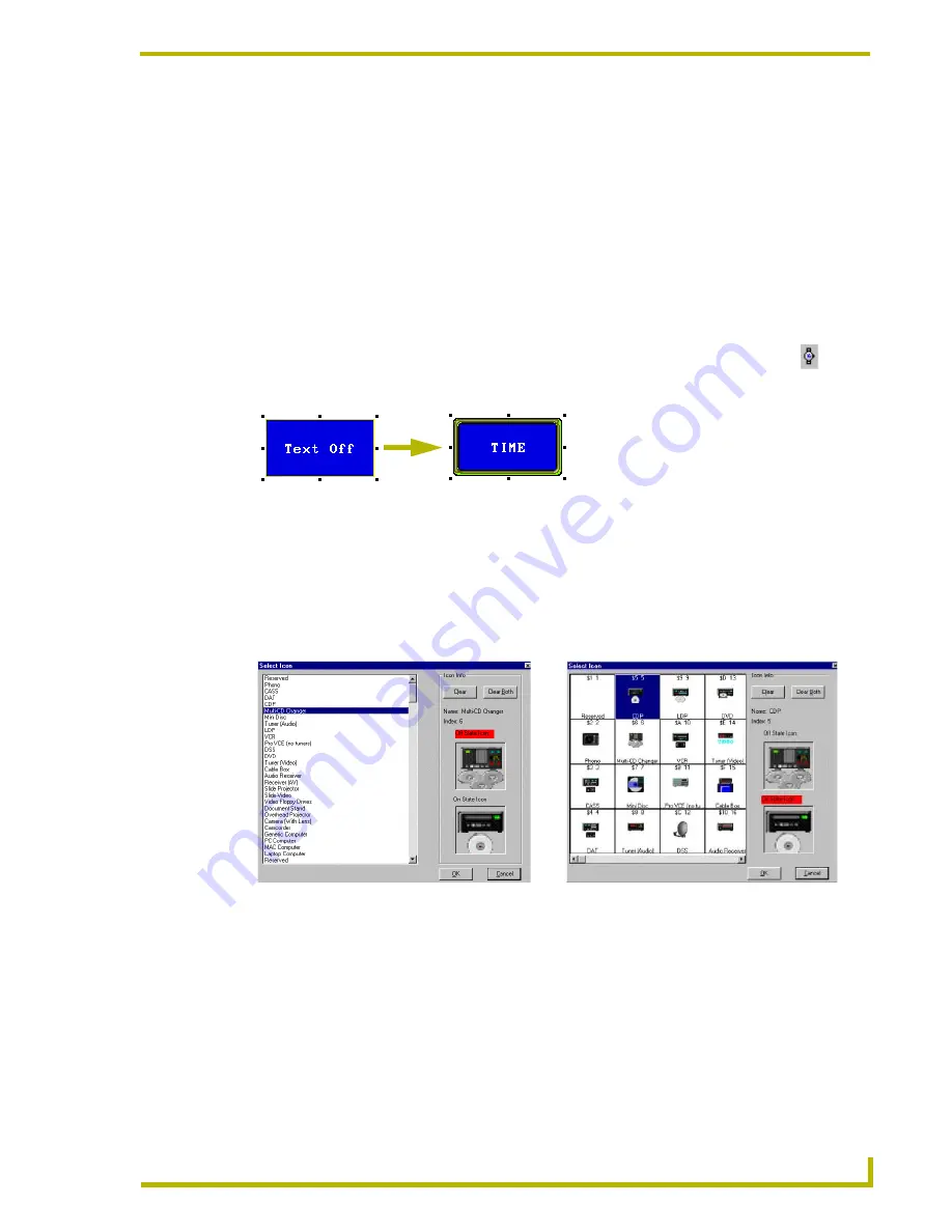
Select a border from the Borders toolbar. FIG. 10 shows a time button using a Neon 2 border.
Selecting an Icon
1.
Click a button to select it.
2.
Select Icon from either the Button drop-down or right-click Button option menus to open one
of the Select Icon dialog boxes shown in FIG. 11. To the left of the Icon Info section is the icon
list. This lists all the available images.
!
To view the text listing of available icons, do not select the Use Graphical Dialog option
from the Edit > Preferences > Application tab.
!
To view the graphical listing of available icons, select the Use Graphical Dialog option
from the Edit > Preferences > Application tab.
3.
Select an icon name from the listing of available icons. The first choice will assign the Off
State Icon.
FIG. 10
Adding a button type
FIG. 11
Select Icon dialog boxes
Use Graphical dialog feature
NOT SELECTED
Use Graphical dialog feature
SELECTED


