Window and Toolbar Reference
11
TPDesign3 Touch Panel Program
Button Types Toolbar
You can use the Button Types toolbar buttons to assign a particular function to a selected button
(the availability of these features are dependant on the type of panel project selected). The Button
Types toolbar is not selectable from the drop-down menus. It is movable and can be placed in either
a vertical or horizontal position.
The Button Types toolbar buttons are lists and described in Figure 5. Select Button Types from the
Tools menu to toggle the main toolbar buttons On or Off in the Workspace.
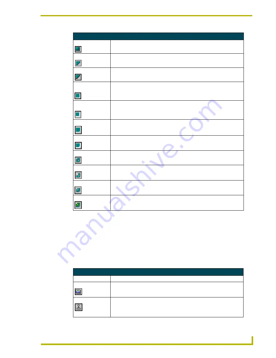
Button Borders Toolbar Buttons (Cont.)
Double Shadow
Changes the selected button border to double shadow.
Single Diamond
Changes the selected button border to single diamond.
Double Diamond
Changes the selected button border to a double diamond.
3D Single
Rectangle
Changes the selected button border to a 3-dimensional rectangle.
3D Double
Rectangle
Changes the selected button border to a 3-dimensional double rectangle.
3D Single Round
Changes the selected button border to a 3-dimensional single round rectangle.
3D Double Round
Changes the selected button border to a 3-dimensional double border with
rounded corners.
Neon 1
Changes the selected button border to single Neon.
Neon 2
Changes the selected button border to double neon.
Blue Neon
Changes the selected button border to a blue neon border.
Green Neon
Changes the selected button border to a green neon border.
Button Types Toolbar Buttons
Button Names
Operation
General
Changes an active button into a general button. Sets the button to automatically
send a message to the Central Controller via the AXlink connector, or through
wireless communication
(Wave Server)
.
Joystick
Changes an active button into a joystick button. Sets the button to a joystick that
includes a control stick. When you move the control stick, the touch panel sends
data to the Central Controller and to the external device to perform a pre-pro-
grammed operation.


