SD-EN-030 25 / 40 V1.0
4.6.8.
List
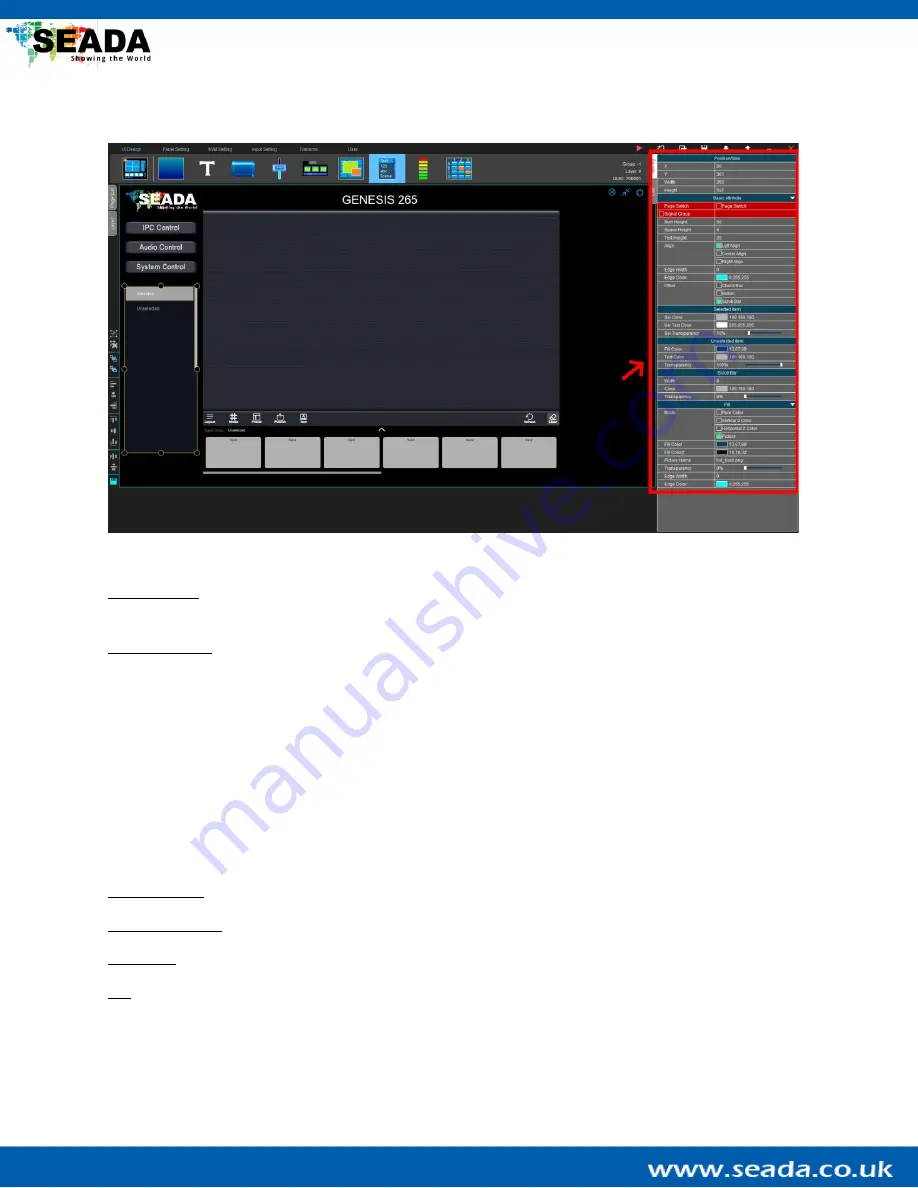
The list component can be used as a list in multiple ways.
Position/Size: Config the position and size of the list component. They can also be adjusted by dragging
the yellow adjustment box around
the component in the ‘
UI Design Area
’.
Basic Attribute:
The list component can be used in multiple ways:
(a)
Page Switch:
Show all the pages that have been created and this list can be used to switch
between different pages in the G265 Client.
(b)
Signal Group:
Choose the input signal group and all the input signals in this group will show in the
list. User can use this list to switch the input signal. Note, real-time preview of the input signals is
not available when using the list component.
User can also change the format of the items in the list, such as the size and space between different
items. Useful tools like check boxes and tool buttons can also be added to the list components.
Selected item: Change the colour of texts for the items in the list when they have been selected.
Unselected item: Change the colour of texts for the items in the list when they have not been selected.
Scroll Bar: Change the width and colour of the scroll bar.
Fill: Change the colour or background design of the list component.


