sensorEDGE Portal
127/166
Pos.
Element
Description
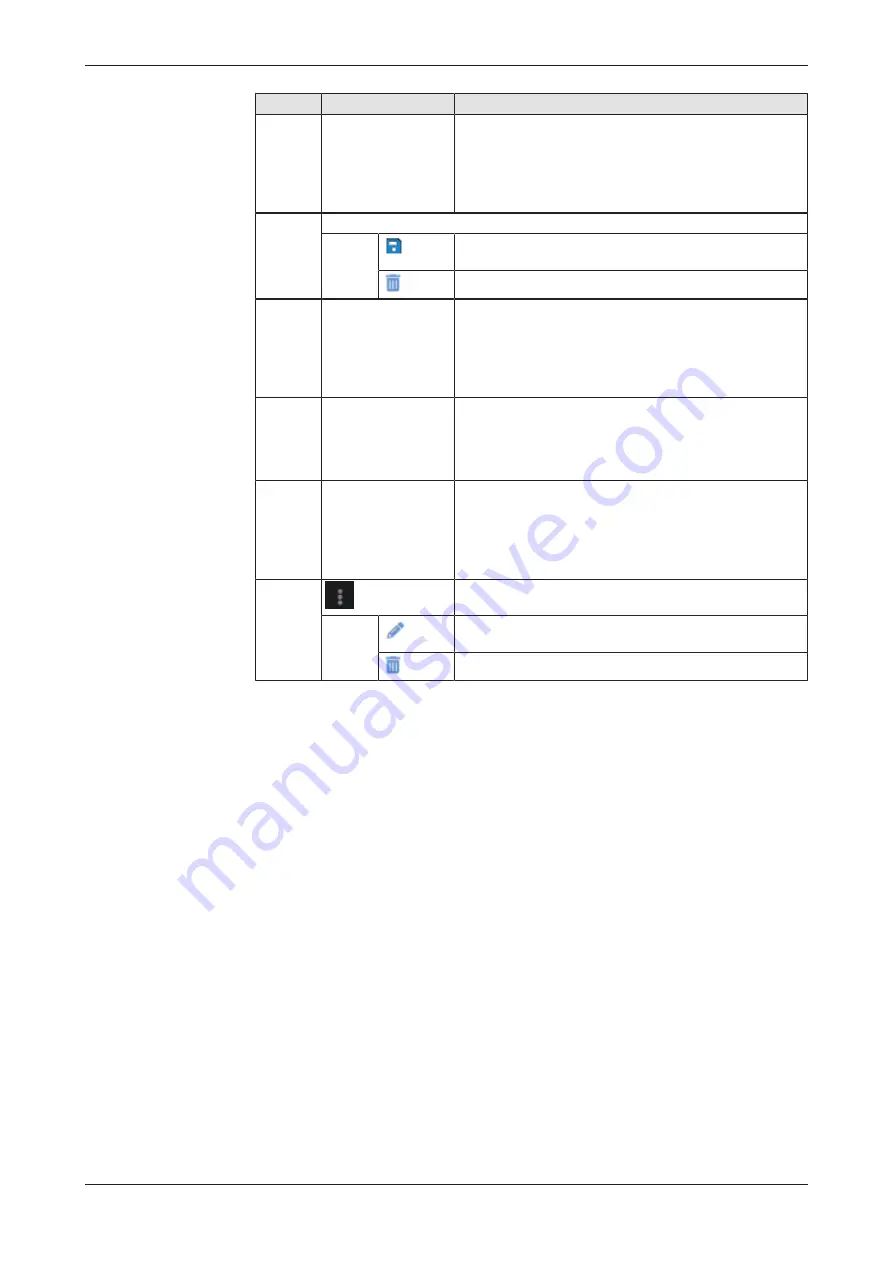
(1)
Widget Gallery
Offers chart widget templates for visualizing sensor data.
If collapsed, click
>
icon to expand.
You can add a chart widget template to your dashboard
by dragging and dropping it onto an empty space in the
main window. For descriptions of the chart widgets, see
positions
(3)
...
(5)
below.
(2)
Tool bar
Save
Saves changes to the dashboard, e.g. after resizing or
rearranging the charts on the dashboard.
Delete
Deletes the dashboard and the configured chart widgets.
(3)
Line Chart
The Line Chart allows you to visualize one or multiple
sensor values (data sources) of the same type (e.g.
distance measured in centimeter) in a single time line.
The green dot on the left of the header indicates that the
sensor(s) are online.
See section
page 129] for details.
(4)
Gauge Chart
The Gauge Chart allows you to visualize the current “live”
value of a single sensor represented as a needle in a
gauge. The green dot on the left of the header indicates
that the sensor is online.
See section
page 134] for details.
(5)
Vertical Bar Chart
The Vertical Bar Chart allows you to visualize current
values of one or multiple sensors of the same type in
bars. The green dot on the left of the header indicates
that the sensor(s) are online
See section
page 138] for
details.
(6)
Chart menu
Each chart widget has a button in the upper right corner
that opens a menu:
Edit
Click this entry to configure the chart (e.g. select new data
sources or change legends and colors).
Delete
Click this entry to delete the chart.
Table 30: Elements in dashboard
netFIELD sensorEDGE | User manual
DOC200601UM01EN | Revision 1 | English | 2021-09 | Released | Public
© Hilscher 2021


