


LabQuest
®
3 User Manual
www.vernier.com/labq3
23
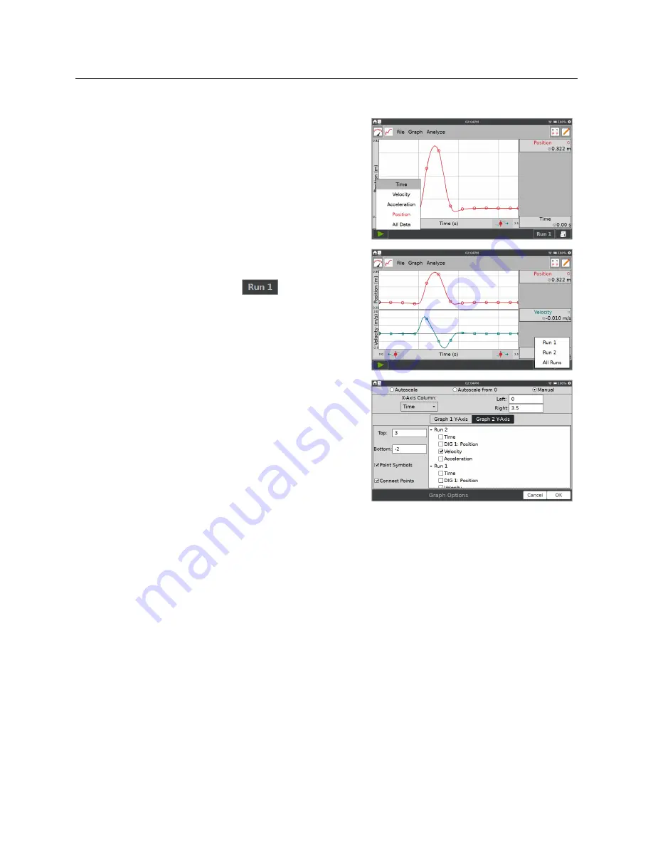
Changing What is Plotted on a Graph
To change what is plotted on a graph, tap the axis
label, and add or remove a column that is plotted.
When data from more than one trial are available, you
can change which run to display or display all runs.
Tap on the Run selector button,
, and select
which run to display.
For even more control over the graph setup, choose
Graph Options from the Graph menu.
Use the Graph Options dialog to change the style of
the graph traces.
Point Symbols
—Surround some, but not all, of the
points with a mark (e.g., a circle or triangle).
Connect Points
—Connect contiguous data points (data-table order) with straight-line
segments. The order the points are connected is determined by their order in the data table.
These lines help the eye follow the data trend but are not equivalent to a curve fit. By
default, connected points are on for time-based collections and off for events-based
collections such as Events with Entry.
Scaling the Graph
The scaling on your graph is set up automatically based on the connected sensors and data-
collection mode. During data collection, the graph autoscales as needed to ensure all collected
data points are shown on the graph. When data collection is complete, the graph updates to fit
the data. If needed, you can adjust the scaling manually
.


