You can customize the background color of the custom view screen by unchecking the Use Default box and
clicking the browse button. You can select different background colors to display depending on a certain
condition at the remote site. Select a color for when the condition is true (or the status channel is in the HIGH
state) and a color for when the condition is false (or the status channel is in the LOW state). If you want the
same background color displayed at all times, choose the same color for both. Then decide if you want a
background image displayed and enter your preference in the Background Image box.
Next, click on the Status Data tab and define the site or unit condition you want associated with the background
color.
Adding, Moving & Deleting Custom View Components
Custom view C
Co
om
mp
po
on
ne
en
nttss are the meters, status indicators, images, labels, etc. that you will see in Lynx when
your custom view is complete. Add a component by clicking the component in the toolbox window and dragging
it into the editing area. To resize a component, click on the component and use the resizing handles, or specify
the desired size in the
General tab of the Properties window.
You can move the component by clicking and dragging, or by going to the
General tab of the Properties window
and specifying X and Y coordinates for the top-left corner of the component. To delete the selected component,
click the Delete icon in the toolbar, or press the delete key.
Grouping Components
When you use multiple components in a single display area (i.e. a status indicator with a label next to it), it is
helpful to group those components so that you can later move them around together instead of individually. To
group components, click on one of them, then press and hold the Control key while you click the remaining
components. Then click the Group icon in the toolbar. Now when you click on one of the components to move it
or delete it, then entire group will be selected. Once selected, you can ungroup a cluster of components by
simply clicking the Ungroup toolbar icon.
COMPONENT PROPERTIES
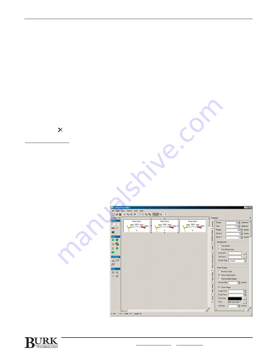
When you add a custom view
component, you will need to define
properties for that object in the
P
Prro
op
pe
errttiie
ess window. If the Properties
window has been closed, you can
display it by clicking the
View Tool
Properties icon in the toolbar. The
Properties window shows properties for
the component you have selected in
the Editor. To select a component, click
on it. To deselect a component, click a
blank area in the designer. The
properties for the selected component
are sorted into different category tabs.
Click the tab to display the properties.
CHAPTER 8: CUSTOM VIEW EDITOR
75
CUSTOMER SUPPORT: 978-486-3711 • [email protected] • www.burk.com
Summary of Contents for GSC3000
Page 8: ...GSC3000 VRC2500 INSTALLATION OPERATION MANUAL viii ...
Page 22: ...GSC3000 VRC2500 INSTALLATION OPERATION MANUAL 14 ...
Page 32: ...GSC3000 VRC2500 INSTALLATION OPERATION MANUAL 24 ...
Page 40: ...GSC3000 VRC2500 INSTALLATION OPERATION MANUAL 32 ...
Page 52: ...GSC3000 VRC2500 INSTALLATION OPERATION MANUAL 44 ...
Page 68: ...GSC3000 VRC2500 INSTALLATION OPERATION MANUAL 60 ...
Page 120: ...GSC3000 VRC2500 INSTALLATION OPERATION MANUAL 112 ...
Page 128: ...GSC3000 VRC2500 INSTALLATION OPERATION MANUAL 120 ...
Page 132: ...GSC3000 VRC2500 INSTALLATION OPERATION MANUAL 124 ...
Page 140: ...GSC3000 VRC2500 INSTALLATION OPERATION MANUAL 132 ...
Page 144: ...GSC3000 VRC2500 INSTALLATION OPERATION MANUAL 136 ...


