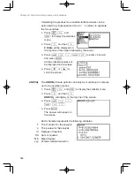

156
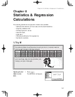
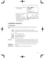
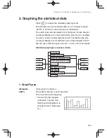
Chapter 8: Statistics & Regression Calculations
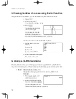
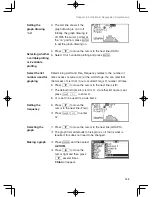
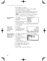
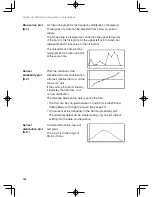
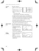
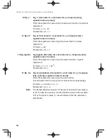
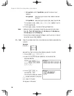
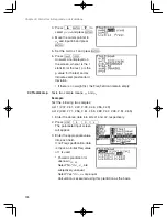
A broken line graph for the frequency distribution of sample (x)
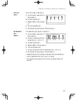
Three types of points can be selected from circle, cross and
square.
The broken line is displayed by connecting the upper left points
of the bars of the histogram, as the upper left point of each bar
represents each class value in the histogram.
The calculator can draw both a
histogram and a broken line plot
at the same time.
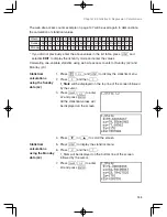
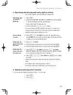
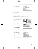
Plots the variance of the
standardized normal distribution
with the statistical data (x) on the
X axis or Y axis.
If the points plot almost linearly,
it indicates that the data is of
normal distribution.
The distance between the dots is set by the Xscl.
• The Xscl can be changed between 1 and 64. Use the Window
Setting Menu to change the figure. (See page 74)
• You cannot set the frequency in the Normal probability plot.
The statistical data must be created using only one list without
splitting into the data and frequency.
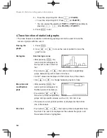
A normal distribution curve of
sample(x)
The x-axis is in the range of
Xmin to Xmax.
Broken line plot
(B.L.)
Normal
probability plot
(N.P.)
Normal
distribution plot
(N.D.)
Содержание el-9950
Страница 1: ......
Страница 11: ...10 Chapter 1 Getting Started To open the cover When in use When not in use Using the Hard Cover ...
Страница 266: ......


