Menu Maker Helper
Page 12 of 38
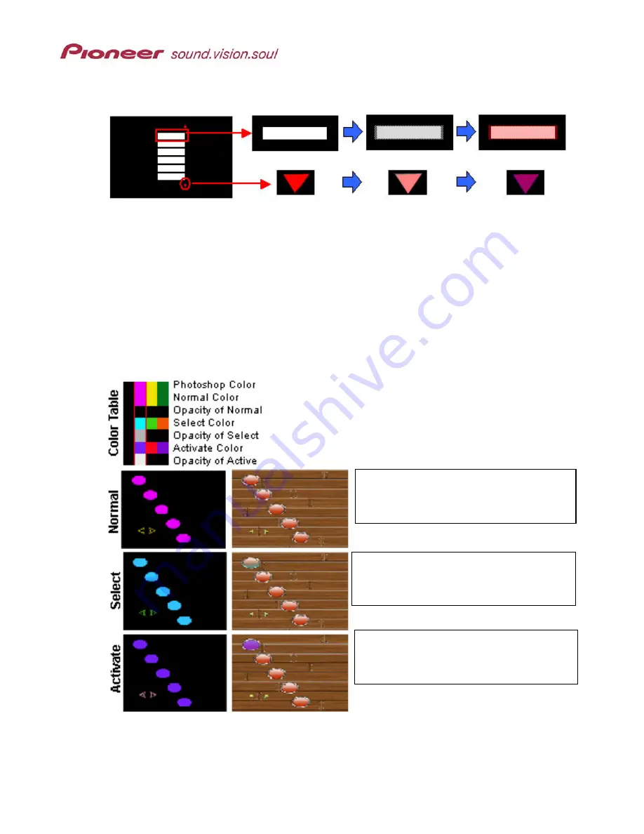
Examples of buttons with Color 2 and Color 3 applied according to the previous chart:
(A Menu Layout)
(Normal View)
(Roll-Over Select)
(Activate)
(Color 2)
(Color 3)
Highlight colors are affected by opacity levels; shown as gray cells on the Color Table. The
darker the shade of gray, the less of the color shows through as a highlight. For example, the
Normal
color is blue (RGB: 75, 50, 250) and the
Select
color is gold (RGB: 240, 200, 5). When
the
Select
color’s opacity level is set to black (15) the button highlight area remains blue (RGB:
75, 50, 250). However, if the
Select
color’s opacity level is changed to 35% gray (approximate
opacity level 10) then the
Normal
color (blue RGB: 75, 50, 250) becomes washed with gold over
the blue when selected. The button highlight changes from a
Normal
state of blue (RGB: 75,
50, 250) to a
Select
state of purple (RGB: 133, 102, 164), a blending of blue with gold.
The following example menu shows how highlights change with different Opacity levels.
Using Color 2 (outlined in red), the Opacity
value for Normal is black so that none of
the color shows through.
Opacity value for Select is 40% gray. Light
blue tints the button when it is selected
(rolled over).
Opacity value for Active is 5% gray so that
the purple highlight actually fills the button
when it is activated.
Note: The higher the contrast number, the stronger the highlight color on the menu.


