22
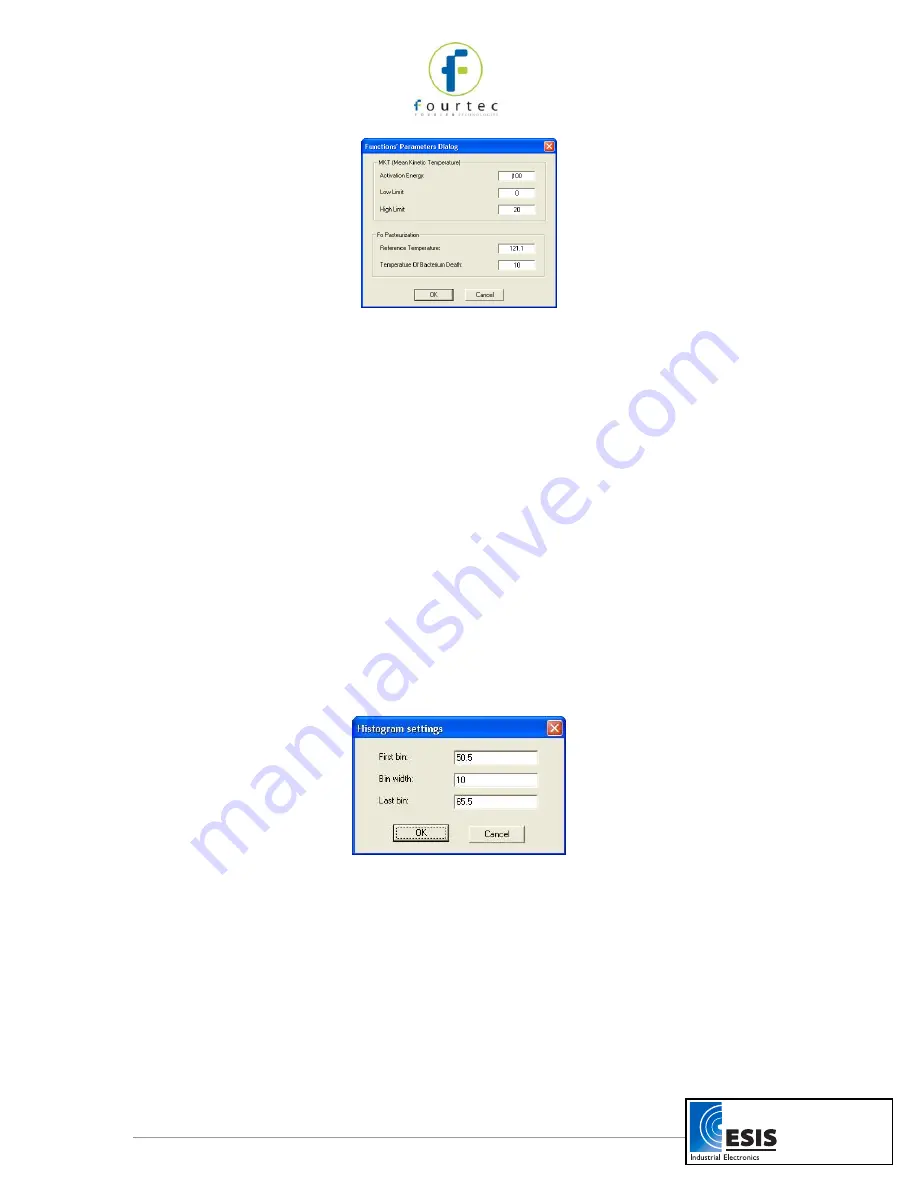
Figure 8: Functions Parameters
2. Type in the desired parameters, and then click
OK.
2.6.2.
Histogram
Use this tool to create a frequency distribution of the selected data set.
To create a histogram:
1. Use the cursor to select a plot on the graph.
2. Click
Analysis
on the main menu bar, and then click
Histogram.
MicroLab Lite displays a histogram of the selected data and creates a new entry in the
Data Map.
Use the Data Map (refer to page 16) to hide the histogram or to return to the original
data sets.
You can modify the histogram to your needs. You can set the upper limits of the first bin
and the lower limit of the last bins, and refine the histogram by increasing the number of
bins.
To modify the histogram:
1. Click
Analysis
on the main menu, then click
Histogram
a second time to open a
dialog:
Figure 9: Histogram settings
2. Enter the desired values for the first bin, the bin width and last bin, and then click
OK.
You can repeat the process for further modification.
2.6.3.
Pasteurization
Use this tool to create and display an FO Pasteurization curve:
Click
Analysis
on the menu bar, and then click
FO pasteurization.
www.esis.com.au
Ph 02 9481 7420
Fax 02 9481 7267


