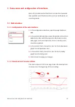
The full-colored lines (1) shows the progress of the mean
value. The brighter areas (2) next to this line show the
maximum and minimum values, which were measured in
the displayed time frames.
The horizontal bars show the thresholds at which alerts are
triggered, their height is specified by the Dead-bands. How
to adjust this value is discussed in chapter 4.4 'Configuration
of alerts'.
The gray bar underneath the chart shows the measurement
period. You can use the two sliders, to scale the displayed
time period.
If the sliders are set to the outer limits of the gray bar, the
whole measurement period is displayed.
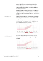
If you have adjusted the period, you can move the area
between the sliders to set the time segment, which you want
to display.
Data access and configuration of interfaces
23
Adjust timescale
Move time period


