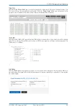
Sync Map Type:
•
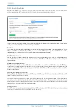
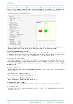
Show reachable: currently reachable nodes are shown in the Sync Map.
•
Show all Nodes: all nodes configured in the monitoring list are shown in the Sync Map, even unreachable
ones.
•
Show NTP only: only nodes which are monitored via NTP protocol are shown in the Sync Map. They
will appear encircled with a yellow ring.
•
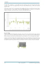
Show PTP only: only nodes which are monitored via PTP protocol will be shown in the Sync Map. Nodes
will appear with a dark blue ring if the PTP with TLV protocol is used for monitoring or with a light blue
ring if the PTP protocol with Management Messages is used.
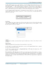
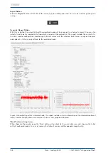
Time Range:
the Sync Map can be generated using the monitoring data sampled in the past
30 min, past 5 min, in the past 24 hrs or within a manually selected time range.
Also the statistical values are calculated using the data in the selected time
interval respectively.
Scaling:
possible scaling options: decade steps or linear for different time accuracy ranges.
For PTP nodes it may be suitable to use scaling in lower microsecond range, whereas
for NTP you can select ranges in a few 100microseconds or millisecond range.
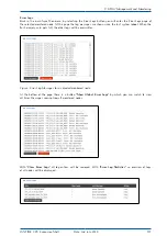
Refresh Button:
Immediately refreshes the Sync Map based on the currently available statistics of each
single node. A new SyncMap with the selected time range will be generated- it is like
a reload of this WEB page with the latest measurements.
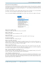
Start Cyclic:
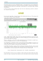
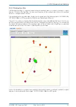
will activate the SyncMap animation mode. In this mode every minute a new SyncMap with
the latest measurements will be generated. The last 60 SyncMaps will be then displayed
as an animation. A new sequence will start with a blank SyncMap. The statistics time
range will be set by default to 5min.
The number of PNGs stored in RAM is set to 1000 in auto refresh mode if a Q7 CPU
or a Syncfire is in use.
Help Button:
will show the online help page for a SyncMap feature.
134
Date: 2nd July 2020
LANTIME CPU Expansion Shelf
Summary of Contents for LCES
Page 2: ......

