

Tutorial: Building custom components with Flex Builder
45
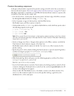
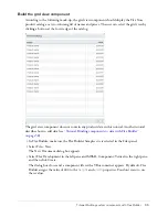
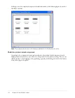
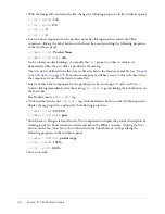
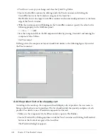
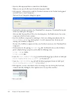
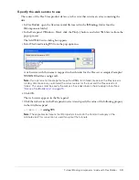
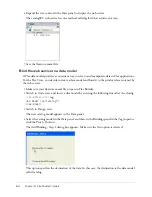
In Design view, the component should look similar to the following figure if you select the Panel
container:
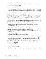
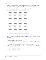
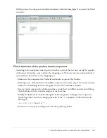
Finish the footer of the product detail component
According to the component mock-up, the footer has a control that lets users specify the quantity
of the selected item they want to add to the shopping cart. The footer also has a button that lets
users add the selected item to the shopping cart.
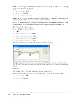
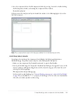
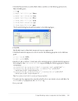
1.
Make sure the component file, ProductDetail.mxml, is open in Flex Builder.
2.
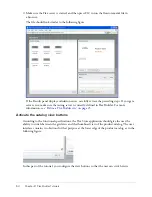
In Design view, click inside the ControlBar container at the lower edge of the Panel container.
Make sure the blinking insertion bar appears inside the ControlBar container.
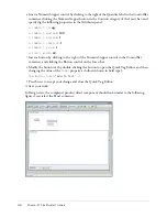
3.
Insert a Label component by clicking anywhere inside the ControlBar container and clicking
the Label button in the Controls category of the Insert bar.
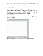
4.
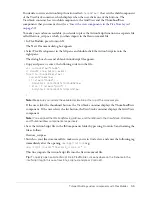
Modify the label text by double-clicking the Label component in Design view to open the
Quick Tag Editor, and then changing the value of the
text
property as follows (shown in
bold type):
<mx:Label text="
Quantity
" />
5.
Press Enter to accept your change and close the Quick Tag Editor.
Summary of Contents for FLEX BUILDER-USING FLEX BUILDER
Page 1: ...Using Flex Builder...
Page 116: ...116 Chapter 4 Building a Flex User Interface Visually...
Page 144: ...144 Chapter 6 Working with Data...
Page 154: ...154 Appendix A Basic Flex Concepts...


