Racelogic Ltd PerformanceTools Software
02/05/2014
Page 65
Additional Data Analysis Features
The software has additional features to aid in data analysis, explained in this section. Many
of these features can be used as a part of the analysis whilst producing Performance results.
The G-Circle
Pressing the G-Circle button produces a plot of the Longitudinal vs Latitudinal
Acceleration data.
A G-circle (or G-G Plot as it is sometimes known) gives a complete overview of how the tyres
are being used. There is a limit to how much G a tyre can generate whilst cornering, and a
set amount it can generate whilst braking/accelerating. There is often a small difference
between these two values, so you may be able to pull more G in braking than in cornering or
vice versa.
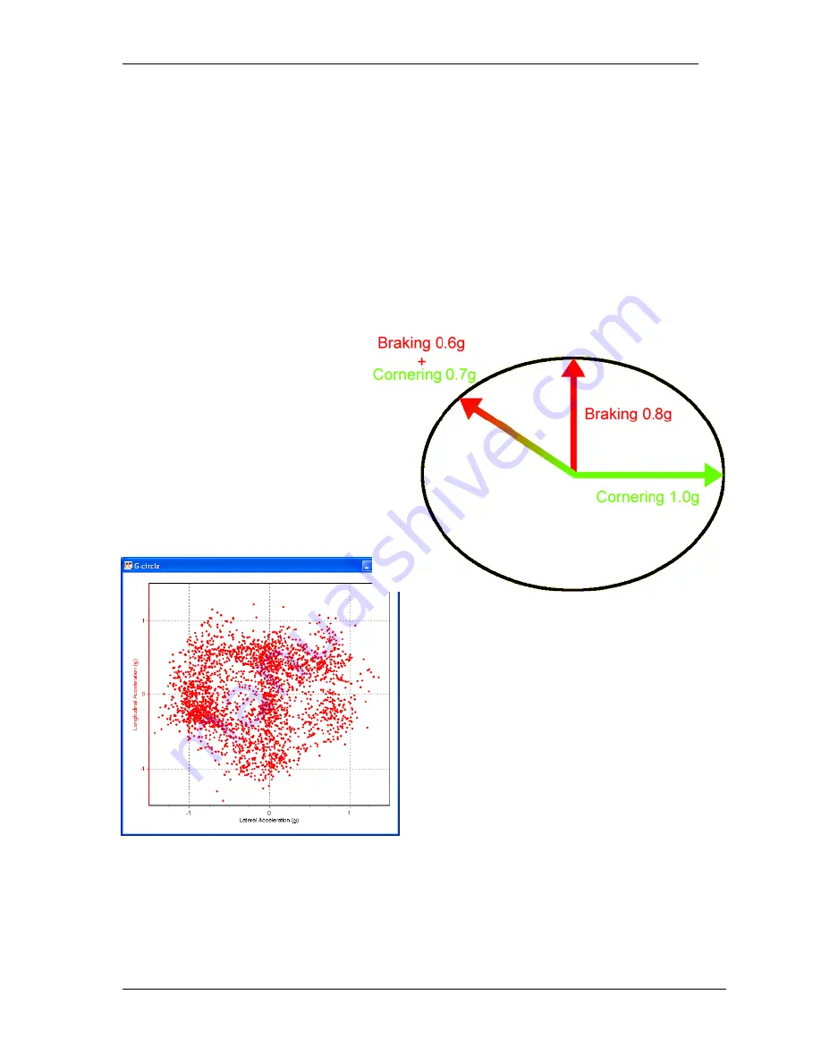
However, if you try and combine
corning whilst braking, then these
limits are reduced. The idea behind a
G-circle is that it tells you how these
can be combined. To the right is a
theoretical perfect G-circle for a
sample tyre.
You can see that the maximum
cornering force is 1g, and max
braking is 0.8g. However, if you are
already braking at 0.6g, then your
max cornering force is only 0.7g.
Plotting out your own G-circle lets you know if
you are exploiting your tyres’ true potential.
Ideally you should get a symmetrical plot, but
bear in mind that you can almost always
generate more G under braking than
acceleration, so the accelerating area will be
shallower than the braking part of the circle.
The example on the left shows a very good
spread of data indicating that the rider
(motorcycle) was able to accelerate and
decelerate whilst cornering to a very good
level, creating a symmetrical plot.
The G-Circle can be examined more closely by zooming in as you do with the Graph:Map,
and by right-click-dragging the current field of view can be moved.


