Racelogic Ltd PerformanceTools Software
02/05/2014
Page 54
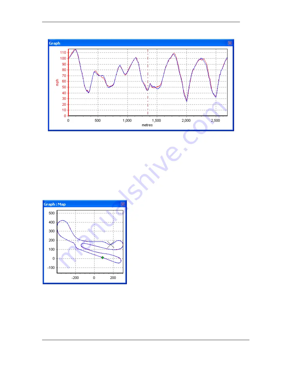
Result in the Graph window:
The main run is in red, the compare run in blue. In this instance the two laps have been
performed very consistently: the peaks and troughs, which indicate the braking and
acceleration points, sit on top of each other almost every time.
Note that the Graph window’s X axis is set to distance – this makes direct comparison of
braking and acceleration points possible as the distance covered on each lap will be virtually
identical. If comparison laps are loaded when the Graph window’s X axis is set to time, the
data is very much more difficult to analyse.
Result in the Graph:Map window:
Note how in this instance, the driver’s lines have
barely deviated between the two laps
– the main
run in red is only just visible below the compare run
in blue.
Three compare laps can be loaded in total,
allowing for comparison of four laps at once (the
main run plus compare runs 1, 2, and 3.) Each
compare lap will have corresponding data
displayed in an individual column in the
Graph:Data window. To change the colours of
each run, open the Channel Setup window and
pick the colours required from the Run
x
columns.


