28
Graphs in Detail
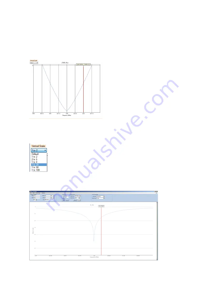
Now that we have a ‘live’ measurement display running, we can examine the displayed charts in
detail. When first started, the cursors (one on each chart) may or may not be present. The cursor will
appear by clicking your mouse anywhere on the chart. The cursor will appear wherever you click on
the chart. When the cursor is on-screen, a text box will appear above it, indicating the frequency and
the pertinent measurement values associated with that chart at that point, as shown here:
Note also the horizontal frequency scale along the bottom, in MHz, and the vertical scale control, top
left. While the frequency scale is fixed (it’s determined by the frequency range you chose when you
calibrated the instrument), you can use the vertical scale control to change the appearance of the
chart to get the best view of the trace.
You can select the vertical scale by clicking on this control, and selecting a suitable range:
Allowable SWR ranges are 2, 5, 8, 20, 50, and 100:1. Similarly, the Return Loss vertical scale can
also be selected, the allowed ranges are -1,-2,-5,-10,-20, and -50dB. Chart Zoom: Any of the charts
displayed here can be zoomed to full-screen by right-clicking on the chart you wish to zoom, allowing
you to examine the trace in greater detail:


