42
Analyzing Tag Data (continued)
HISTOGRAM TAB
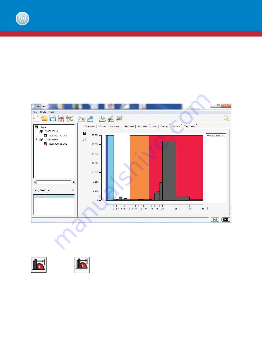
The Histogram tab gives another view of the temperature history recorded by a tag. Shades of red are representative
of high excursion temperatures, shades of blue are representative of low excursion temperatures and white is
representative of optimal temperature. These colors allow easy, at-a-glance interpretation of when excursions have
occurred. The gray bars represent recorded data.
On the histogram tab, users can utilize the following tools to analyze your data:
TREKVIEW SOFTWARE
Rollover
Histogram
Button
Log
Scale
Button
Summary of Contents for Trekview
Page 1: ...1 TREKVIEW MANUAL ...


