26
Elements of Card Design
Backgrounds
Use
the
following
suggestions
to
help
you
select
a
background
for
a
professional
‐
looking
card.
For
best
results,
make
sure
that
the
background
design
does
not
emphasize
the
location
of
card
features,
such
as
embedded
electronics.
Consider
using
a
white
background
for
the
card
to
achieve
consistent
professional
results.
Consider
using
smaller
blocks
of
color,
patterned
areas,
or
gradients
to
highlight
printed
card
features
such
as
a
name,
photo,
or
logo.
Avoid
using
a
solid
‐
color
background
over
a
large
area
of
the
card.
It
can
show
flaws
on
the
card
(such
as
an
uneven
surface)
or
the
location
of
card
features
(such
as
a
smart
card
chip).
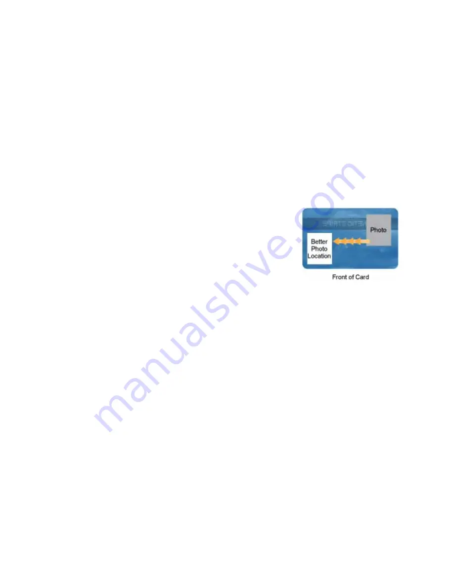
Image Placement
Use
the
following
suggestions
to
help
you
locate
important
images,
such
as
a
photo,
logo,
or
bar
code.
When
placing
images,
avoid
uneven
areas
and
areas
of
high
wear,
which
can
result
in
inconsistent
quality.
Do
not
place
an
important
image
on
the
front
of
the
card
in
the
same
area
as
a
magnetic
stripe
or
other
machine
‐
readable
feature.
Frequent
use
of
a
card
in
a
reader
can
wear
away
the
image
on
the
opposite
side
of
the
card.
Do
not
place
an
important
image
directly
on
the
opposite
side
of
a
signature
panel.
This
can
cause
residue
from
the
signature
panel
to
interfere
with
printing
on
an
adjacent
card.
Place
the
image
above,
below,
or
to
the
side
of
the
panel.
Do
not
place
an
important
image
directly
on
the
opposite
side
of
a
smart
card
chip.
The
card
might
not
be
as
flat
in
that
area,
and
printing
voids
can
occur.
Summary of Contents for SD160
Page 4: ...iv ...
Page 10: ...x ...
Page 28: ...14 Installation ...
Page 78: ...64 Printer Manager ...


