2.
Display grid lines.
3.
Display threshold values.
These options let you tailor the line graph to your personal requirements.
The solid lines display the timeline of the average values. The lighter areas that
surround the graph indicate the max- and min-values that occured during the
corresponding timeframe.
The striped, horizontal bars indicate the threshold values that will trigger alerts.
The bars' thickness corresponds to the dead-band. The color indicates which
sensor the threshold applies to.
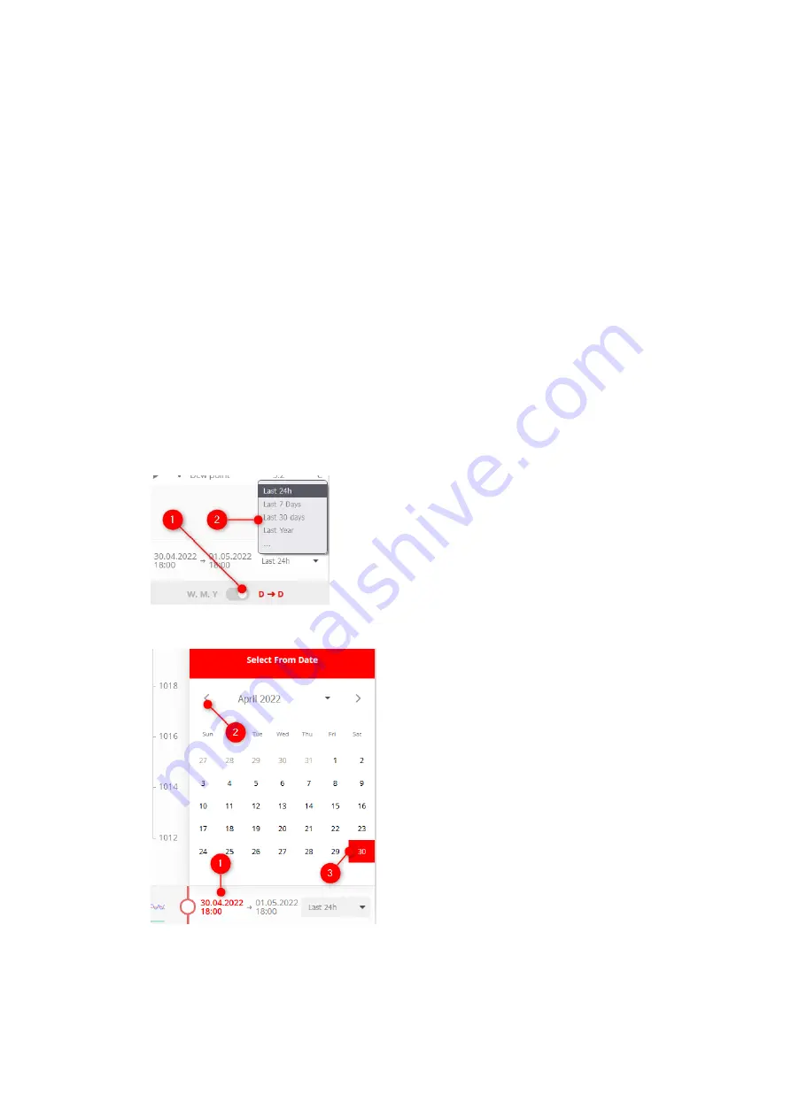
Configuring the Display Period
The display period can be set in the lower right corner of the web interface. You
can select one of two different modes.
The first mode, “D D” ("Day to Day“), lets you view the last 24 hours, the last 7
→
days, the last 30 days or the last year.
Alternatively, you can select a specific start- and end-date.
1.
Clicking the left date opens a calendar.
2.
Select the month for the start date.
28


