25
Viewing Your Data
Detailed data can be viewed from your
Dashboard
on
the
Activ8rlives
4
Wellness App
, by selecting
Dashboard
from the
Menu
, as well as the
Activ8rlives
Blood Pressure2 Monitor.
Touch a tile on the
Dashboard
to open specific data from a device.
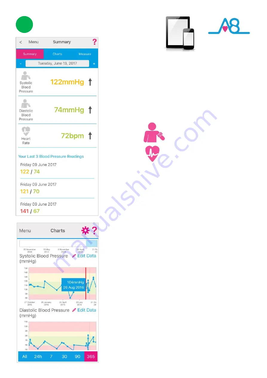
The example shown here gives:
Refer to the Blood Pressure Chart on
Page 11
to see
where your reading falls within the WHO norms
population table.
The
arrows
beside your current reading indicate in
which direction your reading is going: i.e, rising, static or
falling from your last reading. Your
last 3 readings
will
be displayed below for your reference.
Your data can be shown in
Charts
by selecting it from
the top tabs. You can scroll down the page to see other
parameters of your health, such as your medication use,
lung function, weight and wellness levels.
You can display your data over different timeframes, by
changing the time from the bottom
Range Days
:
All,
24h, 7, 30, 90 or 365 days of data.
Colour coding
of parameters within normal
Green
, alert
Amber
and out of parameter
Red
readings are easily
seen on these
Charts
where the background colour
indicates the population norms from World Health
Organisation (WHO).
A
Trackball
function allows you to touch a bar chart or
data point for a specific day and it will give the reading
and date. You can scroll left and right to look at your
data over time.
3
Systolic 122mmHg
Diastolic 74mmHg
Pulse Rate 72bpm


