
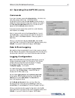

SOLA 610 UPS Optional Features
4.3 Operating CheckUPS II® (cont.)
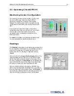
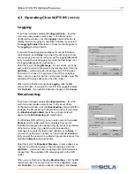
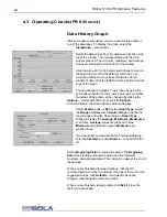
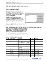
Data History Graph
After some data accumulates, you can view a history graph of
one of the data types. To display the graph, select the
View|Graph…
menu option.
Select the data values from the drop-down list box at the
top of the window. The data associated with the UPS
value is graphed. The minimum, maximum, and average
values are displayed at the bottom of the window.
Click the arrow
<<<
or
>>>
command buttons to move to
the beginning or end of the data log. Click the
<
or
>
command buttons to move back or forward one full
window of data. Click the
command button to print a
copy of the graph.
You can change the graph’s Y-axis range by using the
spin buttons located on the Y-axis. The X-axis and other
properties of the graph can be changed by clicking the
Options…
command button. If you click the
Options…
command button, the
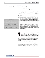
Graph Options
window displays.
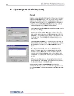
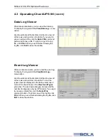
Select
Scatter, Line,
or
Bar
for the
Graph Type
. Select
the
Range on Screen
and
Hours or Days
to define the
X-axis range and units. Depending on
Graph Type
,
choose to display the
Average , Minimums, Maximums,
or all three.
Average
values are graphed in blue.
Minimums
are graphed in green.
Maximums
are
graphed in red.
If you would like to view data from an archived data log,
enter the
File Name
or click
Browse…
to search for the
file.
Set the
Beginning Date
for viewing the graph. The
Beginning
Date
is the starting point used to determine the maximum,
minimum, and average values. The end point is always the end of
the data log.
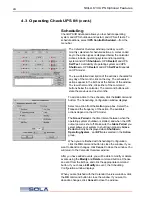
When you are finished with
Graph Options
, click the OK
command button to close the window. If you want to revert to the
suggested values, click
Defaults
. If you want to abandon
changes, click
Cancel
to close the window.
When you are finished viewing graphs, click
Exit
to close the
History Graph
window.
22