21
D1535805 User Guide In-Room Control for Touch10. Produced June 2017 for CE9.0. © 2015–2017 Cisco Systems, Inc. All rights reserved
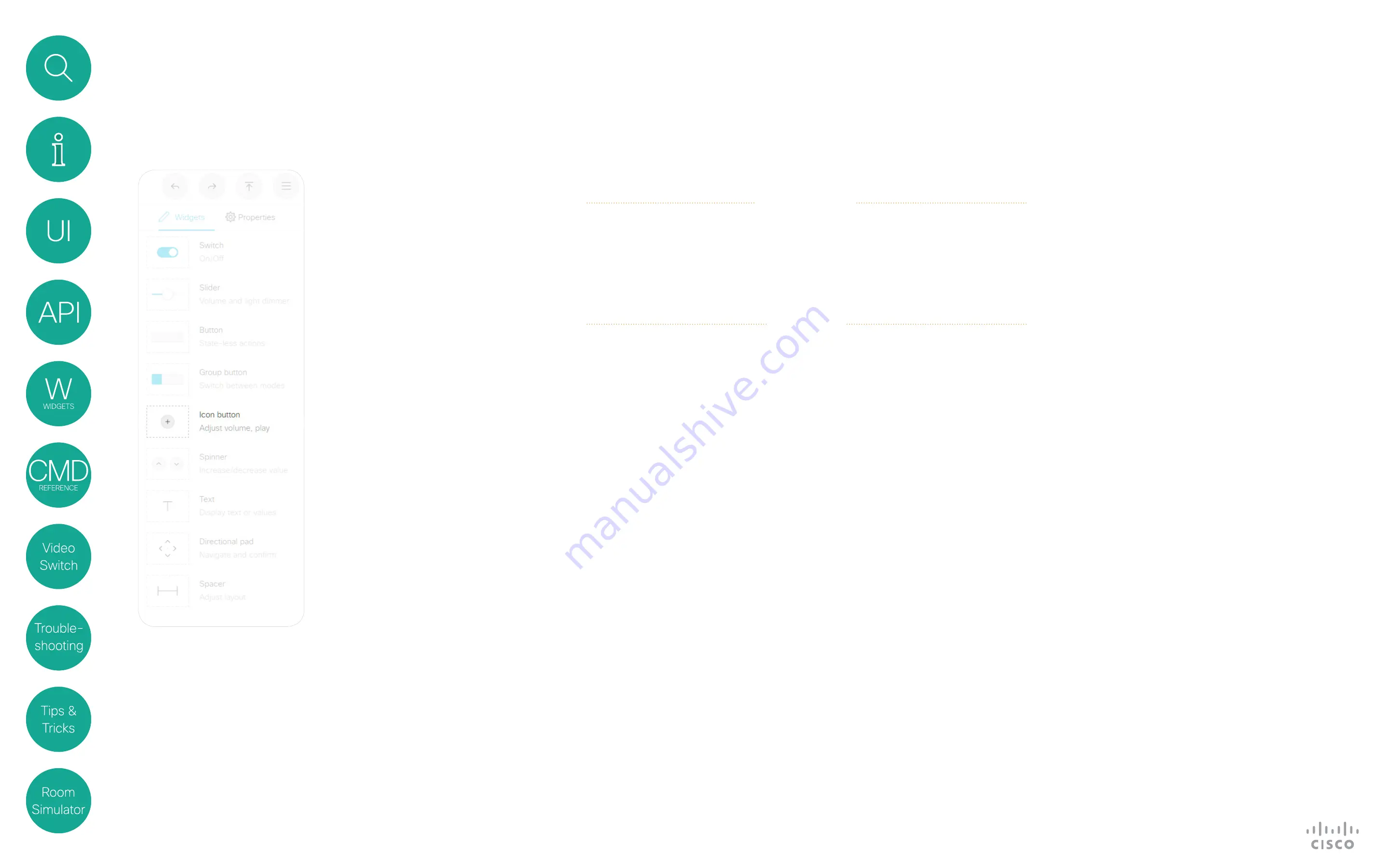
Icon Button
Widgets
Icon buttons share behavior behavior
with buttons having custom text.
A button has two states: active and
inactive. You do not have to set the
button in active state when someone
taps it; the button can be used to just
send a signal without changing its
visual state.
Example of use:
Controls for a
media player, or other devices that
can start, stop, pause.
About Icon Buttons
Events
Example:
Press and release the button with WidgetId = “symbol”.
Terminal mode
*e UserInterface Extensions Event Pressed Signal: “symbol”
** end
*e UserInterface Extensions Event Released Signal: “symbol”
** end
*e UserInterface Extensions Event Clicked Signal: “symbol”
** end
XML mode
<Event>
<UserInterface item=”1”>
<Extensions item=”1”>
<Widget item=”1”>
<Action item=”1”>
<WidgetId item=”1”>symbol</WidgetId>
<Value item=”1”></Value>
<Type item=”1”>clicked</Type>
</Action>
</Widget>
</Extensions>
</UserInterface>
</Event>
Pressed Triggered when the
button is pressed.
Value: N/A
Released Triggered when the
button is released.
Value: N/A
Clicked Triggered when the
button is released
Value: N/A
Commands
Use the
SetValue
command to
highlight or not the button in the
user interface. A value of “
active
”
will highlight the button, and a value
of “
inactive
” will release it.
Example:
Highlight the button with WidgetId = “symbol” (set it in active
state)
xCommand UserInterface Extensions Widget SetValue WidgetId: “symbol”
Value: “active”


