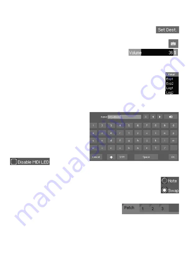
Button:
Pressing it triggers an action, like a physical key does.
Slider:
Allows to set a value. Simply drag the slider
horizontally to change its value. You can also enter a
numerical value by using the virtual keypad that shows up
at the top right corner of the screen.
List:
Allows you to select an element in a list. You can swipe it vertically to
quickly scroll across the elements, or slowly move your fingertip to reach
precisely what you are seeking. Any element can also be accessed by entering
its index with the virtual numerical keypad (by pressing on the keypad button
after it’s focused, like the slider).
Text field:
Allows you to enter text data
(e.g. patch name). Pressing it opens the
alphanumeric virtual keyboard.
Checkbox:
Controls a parameter that
can be activated (checked) or
deactivated (unchecked).
Radio Button:
Allows to make a choice between several options. Unlike
checkboxes, radio buttons are at least two, and only one can be selected at a
time into a set.
Tab field:
Splits interface elements into several tabs,
which are like small pages. Press on its header to access
its contents. The current active tab has a lighter color
and is offset compared to the others.
9
Содержание EssenceFM
Страница 1: ...English Other languages and PDFs available at kodamo org...
Страница 2: ......
Страница 40: ...Memo 39...
Страница 41: ......


