Transaction Volume per Hour
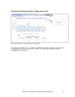
Daily Transaction Volume per Hour Graph.
In the Transaction Volume per Hour graph, the thin blue line illustrates the average interactive
transaction volume per hour for each day during the last three months. The thick red line shows
the average transaction volume for the hour that had the most transactions for each day during
the last three months.
The graph also shows the growth during the last:
Twelve
months
Six
months
Three
months
One
month
66
PM for Power Systems Graph Reference Document


